🗺 EOmaps examples
… a collection of examples that show how to create beautiful interactive maps.
Basic data visualization
There are 3 basic steps required to visualize your data:
Initialize a Maps-object with
m = Maps()Set the data and its specifications via
m.set_dataCall
m.plot_map()to generate the map!
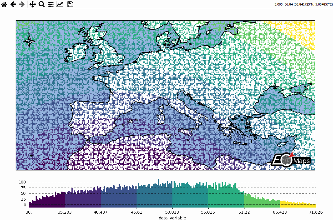
# EOmaps: A simple map

from eomaps import Maps
import pandas as pd
import numpy as np

# ----------- create some example-data
lon, lat = np.meshgrid(np.arange(-20, 40, 0.25), np.arange(30, 60, 0.25))
data = pd.DataFrame(
    dict(lon=lon.flat, lat=lat.flat, data_variable=np.sqrt(lon**2 + lat**2).flat)
)
data = data.sample(15000)  # take 15000 random datapoints from the dataset
# ------------------------------------

m = Maps(crs=4326)
m.add_title("Click on the map to pick datapoints!")
m.add_feature.preset.ocean()
m.add_feature.preset.coastline()
m.set_data(
    data=data,  # a pandas-DataFrame holding the data & coordinates
    parameter="data_variable",  # the DataFrame-column you want to plot
    x="lon",  # the name of the DataFrame-column representing the x-coordinates
    y="lat",  # the name of the DataFrame-column representing the y-coordinates
    crs=4326,  # the coordinate-system of the x- and y- coordinates
)
m.plot_map()
m.add_colorbar(label="A dataset")

c = m.add_compass((0.05, 0.86), scale=7, patch=None)

m.cb.pick.attach.annotate()  # attach a pick-annotation (on left-click)
m.add_logo()  # add a logo
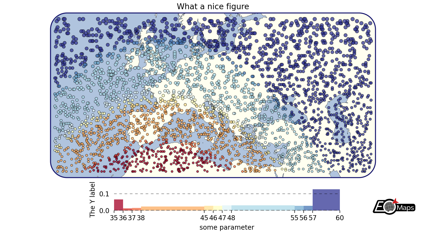
Customize the appearance of the plot
use
m.set_plot_specs()to set the general appearance of the plotafter creating the plot, you can access individual objects via
m.figure.<...>… most importantly:f: the matplotlib figureax,ax_cb,ax_cb_plot: the axes used for plotting the map, colorbar and histogramgridspec,cb_gridspec: the matplotlib GridSpec instances for the plot and the colorbarcoll: the collection representing the data on the map
# EOmaps example: Customize the appearance of the plot

from eomaps import Maps
import pandas as pd
import numpy as np

# ----------- create some example-data
lon, lat = np.meshgrid(np.arange(-30, 60, 0.25), np.arange(30, 60, 0.3))
data = pd.DataFrame(
    dict(lon=lon.flat, lat=lat.flat, data_variable=np.sqrt(lon**2 + lat**2).flat)
)
data = data.sample(3000)  # take 3000 random datapoints from the dataset
# ------------------------------------

m = Maps(crs=3857, figsize=(9, 5))
m.set_frame(rounded=0.2, lw=1.5, ec="midnightblue", fc="ivory")
m.text(0.5, 0.97, "What a nice figure", fontsize=12)

m.add_feature.preset.ocean(fc="lightsteelblue")
m.add_feature.preset.coastline(lw=0.25)

m.set_data(data=data, x="lon", y="lat", crs=4326)
m.set_shape.geod_circles(radius=30000)  # plot geodesic-circles with 30 km radius
m.set_classify_specs(
    scheme="UserDefined", bins=[35, 36, 37, 38, 45, 46, 47, 48, 55, 56, 57, 58]
)
m.plot_map(
    edgecolor="k",  # give shapes a black edgecolor
    linewidth=0.5,  # with a linewidth of 0.5
    cmap="RdYlBu",  # use a red-yellow-blue colormap
    vmin=35,  # map colors to values between 35 and 60
    vmax=60,
    alpha=0.75,  # add some transparency
)

# add a colorbar
m.add_colorbar(
    label="some parameter",
    hist_bins="bins",
    hist_size=1,
    hist_kwargs=dict(density=True),
)

# add a y-label to the histogram
m.colorbar.ax_cb_plot.set_ylabel("The Y label")

# add a logo to the plot
m.add_logo()

m.apply_layout(
    {
        "figsize": [9.0, 5.0],
        "0_map": [0.10154, 0.2475, 0.79692, 0.6975],
        "1_cb": [0.20125, 0.0675, 0.6625, 0.135],
        "1_cb_histogram_size": 1,
        "2_logo": [0.87501, 0.09, 0.09999, 0.07425],
    }
)
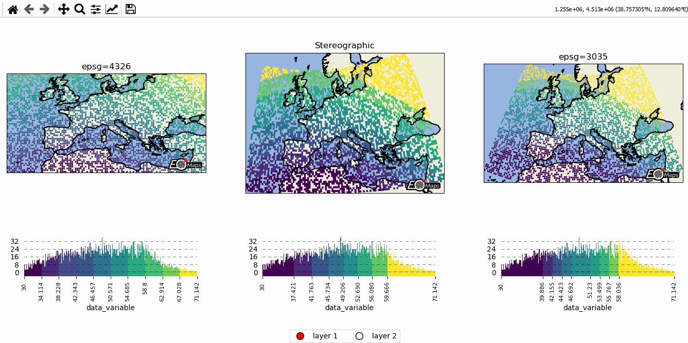
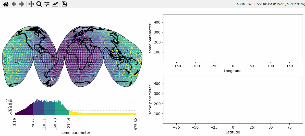
Data-classification and multiple Maps in a figure
Create grids of maps via
MapsGrid- Classify your data via
m.set_classify_specs(scheme, **kwargs)(using classifiers provided by themapclassifymodule) - Add individual callback functions to each subplot via
m.cb.click.attach,m.cb.pick.attach - Share events between Maps-objects of the MapsGrid via
mg.share_click_events()andmg.share_pick_events()
# EOmaps example: Data-classification and multiple Maps in one figure

from eomaps import Maps
import pandas as pd
import numpy as np

# ----------- create some example-data
lon, lat = np.meshgrid(np.arange(-20, 40, 0.5), np.arange(30, 60, 0.5))
data = pd.DataFrame(
    dict(lon=lon.flat, lat=lat.flat, data_variable=np.sqrt(lon**2 + lat**2).flat)
)
data = data.sample(4000)  # take 4000 random datapoints from the dataset
# ------------------------------------

# initialize a grid of Maps objects
m = Maps(ax=131, crs=4326, figsize=(11, 5))
m2 = Maps(f=m.f, ax=132, crs=Maps.CRS.Stereographic())
m3 = Maps(f=m.f, ax=133, crs=3035)

# --------- set specs for the first map
m.text(0.5, 1.1, "epsg=4326", transform=m.ax.transAxes)
m.set_classify_specs(scheme="EqualInterval", k=10)

# --------- set specs for the second map
m2.text(0.5, 1.1, "Stereographic", transform=m2.ax.transAxes)
m2.set_shape.rectangles()
m2.set_classify_specs(scheme="Quantiles", k=8)

# --------- set specs for the third map
m3.text(0.5, 1.1, "epsg=3035", transform=m3.ax.transAxes)
m3.set_classify_specs(
    scheme="StdMean",
    multiples=[-1, -0.75, -0.5, -0.25, 0.25, 0.5, 0.75, 1],
)

# --------- plot all maps and add colorbars to all maps
# set the data on ALL maps-objects of the grid
for m_i in [m, m2, m3]:
    m_i.set_data(data=data, x="lon", y="lat", crs=4326)
    m_i.plot_map()
    m_i.add_colorbar(extend="neither")

    m_i.add_feature.preset.ocean()
    m_i.add_feature.preset.land()
    # add the coastline to all layers of the maps
    m_i.add_feature.preset.coastline(layer="all")


# --------- add a new layer for the second axis
# NOTE: this layer is not visible by default but it can be shown by clicking
# on the layer-switcher utility buttons (bottom center of the figure)
# or by using `m2.show()`   or via  `m.show_layer("layer 2")`
m21 = m2.new_layer(layer="layer 2")
m21.inherit_data(m2)
m21.set_shape.delaunay_triangulation(mask_radius=0.5)
m21.set_classify_specs(scheme="Quantiles", k=4)
m21.plot_map(cmap="RdYlBu")
m21.add_colorbar(extend="neither")
# add an annotation that is only executed if "layer 2" is active
m21.cb.click.attach.annotate(text="callbacks are layer-sensitive!")

# --------- add some callbacks to indicate the clicked data-point to all maps
for m_i in [m, m2, m3]:
    m_i.cb.pick.attach.mark(fc="r", ec="none", buffer=1, permanent=True)
    m_i.cb.pick.attach.mark(fc="none", ec="r", lw=1, buffer=5, permanent=True)
    m_i.cb.move.attach.mark(fc="none", ec="k", lw=2, buffer=10, permanent=False)

for m_i in [m, m2, m21, m3]:
    # --------- rotate the ticks of the colorbars
    m_i.colorbar.ax_cb.tick_params(rotation=90, labelsize=8)
    # add logos
    m_i.add_logo(size=0.05)

# add an annotation-callback to the second map
m2.cb.pick.attach.annotate(text="the closest point is here!", zorder=99)

# share click & pick-events between all Maps-objects of the MapsGrid
m.cb.move.share_events(m2, m3)
m.cb.pick.share_events(m2, m3)

# --------- add a layer-selector widget
m.util.layer_selector(ncol=2, loc="lower center", draggable=False)


m.apply_layout(
    {
        "figsize": [11.0, 5.0],
        "0_map": [0.015, 0.44, 0.3125, 0.34375],
        "1_map": [0.35151, 0.363, 0.32698, 0.50973],
        "2_map": [0.705, 0.44, 0.2875, 0.37872],
        "3_cb": [0.05522, 0.0825, 0.2625, 0.2805],
        "3_cb_histogram_size": 0.8,
        "4_cb": [0.33625, 0.11, 0.3525, 0.2],
        "4_cb_histogram_size": 0.8,
        "5_cb": [0.72022, 0.0825, 0.2625, 0.2805],
        "5_cb_histogram_size": 0.8,
        "6_logo": [0.2725, 0.451, 0.05, 0.04538],
        "7_logo": [0.625, 0.3795, 0.05, 0.04538],
        "8_logo": [0.625, 0.3795, 0.05, 0.04538],
        "9_logo": [0.93864, 0.451, 0.05, 0.04538],
    }
)
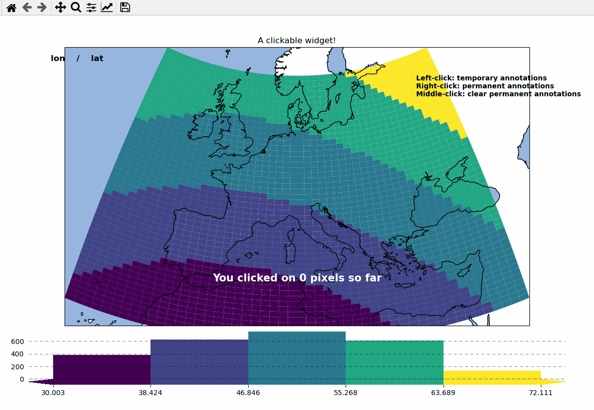
Callbacks - turn your maps into interactive widgets
Callback functions can easily be attached to the plot to turn it into an interactive plot-widget!
- there’s a nice list of (customizable) pre-defined callbacks accessible via:
m.cb.click,m.cb.pick,m.cb.keypressandm.cb.dynamicuse
annotate(andclear_annotations) to create text-annotationsuse
mark(andclear_markers) to add markersuse
peek_layer(andswitch_layer) to compare multiple layers of data… and many more:
plot,print_to_console,get_values,load…
- … but you can also define a custom one and connect it via
m.cb.click.attach(<my custom function>)(works also withpickandkeypress)!
# EOmaps example: Turn your maps into a powerful widgets

from eomaps import Maps
import pandas as pd
import numpy as np

# create some data
lon, lat = np.meshgrid(np.linspace(-20, 40, 50), np.linspace(30, 60, 50))

data = pd.DataFrame(
    dict(lon=lon.flat, lat=lat.flat, data=np.sqrt(lon**2 + lat**2).flat)
)

# --------- initialize a Maps object and plot a basic map
m = Maps(crs=3035, figsize=(10, 8))
m.set_data(data=data, x="lon", y="lat", crs=4326)
m.ax.set_title("A clickable widget!")
m.set_shape.rectangles()

m.set_classify_specs(scheme="EqualInterval", k=5)
m.add_feature.preset.coastline()
m.add_feature.preset.ocean()
m.plot_map()

# add some static text
m.text(
    0.66,
    0.92,
    (
        "Left-click: temporary annotations\n"
        "Right-click: permanent annotations\n"
        "Middle-click: clear permanent annotations"
    ),
    fontsize=10,
    horizontalalignment="left",
    verticalalignment="top",
    color="k",
    fontweight="bold",
    bbox=dict(facecolor="w", alpha=0.75),
)


# --------- attach pre-defined CALLBACK functions ---------

### add a temporary annotation and a marker if you left-click on a pixel
m.cb.pick.attach.mark(
    button=1,
    permanent=False,
    fc=[0, 0, 0, 0.5],
    ec="w",
    ls="--",
    buffer=2.5,
    shape="ellipses",
    zorder=1,
)
m.cb.pick.attach.annotate(
    button=1,
    permanent=False,
    bbox=dict(boxstyle="round", fc="w", alpha=0.75),
    zorder=999,
)
### save all picked values to a dict accessible via m.cb.get.picked_vals
m.cb.pick.attach.get_values(button=1)

### add a permanent marker if you right-click on a pixel
m.cb.pick.attach.mark(
    button=3,
    permanent=True,
    facecolor=[1, 0, 0, 0.5],
    edgecolor="k",
    buffer=1,
    shape="rectangles",
    zorder=1,
)

### add a customized permanent annotation if you right-click on a pixel
def text(m, ID, val, pos, ind):
    return f"ID={ID}"


m.cb.pick.attach.annotate(
    button=3,
    permanent=True,
    bbox=dict(boxstyle="round", fc="r"),
    text=text,
    xytext=(10, 10),
    zorder=2,  # use zorder=2 to put the annotations on top of the markers
)

### remove all permanent markers and annotations if you middle-click anywhere on the map
m.cb.pick.attach.clear_annotations(button=2)
m.cb.pick.attach.clear_markers(button=2)

# --------- define a custom callback to update some text to the map
# (use a high zorder to draw the texts above all other things)
txt = m.text(
    0.5,
    0.35,
    "You clicked on 0 pixels so far",
    fontsize=15,
    horizontalalignment="center",
    verticalalignment="top",
    color="w",
    fontweight="bold",
    animated=True,
    zorder=99,
    transform=m.ax.transAxes,
)
txt2 = m.text(
    0.18,
    0.9,
    "   lon    /    lat " + "\n",
    fontsize=12,
    horizontalalignment="right",
    verticalalignment="top",
    fontweight="bold",
    animated=True,
    zorder=99,
    transform=m.ax.transAxes,
)


def cb1(m, pos, ID, val, **kwargs):
    # update the text that indicates how many pixels we've clicked
    nvals = len(m.cb.pick.get.picked_vals["ID"])
    txt.set_text(
        f"You clicked on {nvals} pixel"
        + ("s" if nvals > 1 else "")
        + "!\n... and the "
        + ("average " if nvals > 1 else "")
        + f"value is {np.mean(m.cb.pick.get.picked_vals['val']):.3f}"
    )

    # update the list of lon/lat coordinates on the top left of the figure
    d = m.data.loc[ID]
    lonlat_list = txt2.get_text().splitlines()
    if len(lonlat_list) > 10:
        lonlat_txt = lonlat_list[0] + "\n" + "\n".join(lonlat_list[-10:]) + "\n"
    else:
        lonlat_txt = txt2.get_text()
    txt2.set_text(lonlat_txt + f"{d['lon']:.2f}  /  {d['lat']:.2f}" + "\n")


m.cb.pick.attach(cb1, button=1, m=m)


def cb2(m, pos, val, **kwargs):
    # plot a marker at the pixel-position
    (l,) = m.ax.plot(*pos, marker="*", animated=True)
    # add the custom marker to the blit-manager!
    m.BM.add_artist(l)

    # print the value at the pixel-position
    # use a low zorder so the text will be drawn below the temporary annotations
    m.text(
        pos[0],
        pos[1] - 150000,
        f"{val:.2f}",
        horizontalalignment="center",
        verticalalignment="bottom",
        color=l.get_color(),
        zorder=1,
        transform=m.ax.transData,
    )


m.cb.pick.attach(cb2, button=3, m=m)

# add a "target-indicator" on mouse-movement
m.cb.move.attach.mark(fc="r", ec="none", radius=10000, shape="geod_circles")
m.cb.move.attach.mark(fc="none", ec="r", radius=50000, shape="geod_circles")

# add a colorbar
m.add_colorbar(hist_bins="bins", label="A classified dataset")
m.add_logo()

m.apply_layout(
    {
        "figsize": [10.0, 8.0],
        "0_map": [0.04375, 0.27717, 0.9125, 0.69566],
        "1_cb": [0.01, 0.0, 0.98, 0.23377],
        "1_cb_histogram_size": 0.8,
        "2_logo": [0.825, 0.29688, 0.12, 0.06188],
    }
)
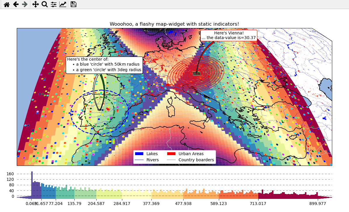
Overlays, markers and annotations
(… plot-generation might take a bit longer since overlays need to be downloaded first!)
add basic overlays with m.add_overlay
add static annotations / markers with m.add_annotation and m.add_marker
use “connected” Maps-objects to get multiple interactive data-layers!
# EOmaps example: Add overlays and indicators

from eomaps import Maps
import pandas as pd
import numpy as np
import matplotlib.pyplot as plt
from matplotlib.patches import Patch

# create some data
lon, lat = np.meshgrid(np.linspace(-20, 40, 100), np.linspace(30, 60, 100))
data = pd.DataFrame(
    dict(
        lon=lon.flat,
        lat=lat.flat,
        param=(((lon - lon.mean()) ** 2 - (lat - lat.mean()) ** 2)).flat,
    )
)
data_OK = data[data.param >= 0]
data_OK.var = np.sqrt(data_OK.param)
data_mask = data[data.param < 0]

# --------- initialize a Maps object and plot the data
m = Maps(Maps.CRS.Orthographic(), figsize=(10, 7))
m.ax.set_title("Wooohoo, a flashy map-widget with static indicators!")
m.set_data(data=data_OK, x="lon", y="lat", crs=4326)
m.set_shape.rectangles(mesh=True)
m.set_classify_specs(scheme="Quantiles", k=10)
m.plot_map(cmap="Spectral_r")

# ... add an "annotate" callback
cid = m.cb.click.attach.annotate(bbox=dict(alpha=0.75, color="w"))

# - create a new layer and plot another dataset
m2 = m.new_layer()
m2.set_data(data=data_mask, x="lon", y="lat", crs=4326)
m2.set_shape.rectangles()
m2.plot_map(cmap="magma", set_extent=False)

# create a new layer for some dynamically updated data
m3 = m.new_layer()
m3.set_data(data=data_OK.sample(1000), x="lon", y="lat", crs=4326)
m3.set_shape.ellipses(radius=25000, radius_crs=3857)

# plot the map and set dynamic=True to allow continuous updates of the
# collection without re-drawing the background map
m3.plot_map(
    cmap="gist_ncar", edgecolor="w", linewidth=0.25, dynamic=True, set_extent=False
)

# define a callback that changes the values of the previously plotted dataset
# NOTE: this is not possible for the shapes:  "shade_points" and "shade_raster"!
def callback(m, **kwargs):
    # NOTE: Since we change the array of a dynamic collection, the changes will be
    # reverted as soon as the background is re-drawn (e.g. on pan/zoom events)
    selection = np.random.randint(0, len(m.data), 1000)
    m.coll.set_array(data_OK.param.iloc[selection])


# attach the callback (to update the dataset plotted on the Maps object "m3")
m.cb.click.attach(callback, m=m3, on_motion=True)

# --------- add some basic overlays from NaturalEarth
m.add_feature.preset.coastline()
m.add_feature.preset.lakes()
m.add_feature.preset.rivers_lake_centerlines()
m.add_feature.preset.countries()
m.add_feature.preset.urban_areas()

# add a customized legend
leg = m.ax.legend(
    [
        Patch(fc="b"),
        plt.Line2D([], [], c="b"),
        Patch(fc="r"),
        plt.Line2D([], [], c=".75"),
    ],
    ["lakes", "rivers", "urban areas", "countries"],
    ncol=2,
    loc="lower center",
    facecolor="w",
    framealpha=1,
)
# add the legend as artist to keep it on top
m.BM.add_artist(leg)

# --------- add some fancy (static) indicators for selected pixels
mark_id = 6060
for buffer in np.linspace(1, 5, 10):
    m.add_marker(
        ID=mark_id,
        shape="ellipses",
        radius="pixel",
        fc=(1, 0, 0, 0.1),
        ec="r",
        buffer=buffer * 5,
        n=100,  # use 100 points to represent the ellipses
    )
m.add_marker(
    ID=mark_id, shape="rectangles", radius="pixel", fc="g", ec="y", buffer=3, alpha=0.5
)
m.add_marker(
    ID=mark_id, shape="ellipses", radius="pixel", fc="k", ec="none", buffer=0.2
)
m.add_annotation(
    ID=mark_id,
    text=f"Here's Vienna!\n... the data-value is={m.data.param.loc[mark_id]:.2f}",
    xytext=(80, 70),
    textcoords="offset points",
    bbox=dict(boxstyle="round", fc="w", ec="r"),
    horizontalalignment="center",
    arrowprops=dict(arrowstyle="fancy", facecolor="r", connectionstyle="arc3,rad=0.35"),
)

mark_id = 3324
m.add_marker(ID=mark_id, shape="ellipses", radius=3, fc="none", ec="g", ls="--", lw=2)
m.add_annotation(
    ID=mark_id,
    text="",
    xytext=(0, 98),
    textcoords="offset points",
    arrowprops=dict(
        arrowstyle="fancy", facecolor="g", connectionstyle="arc3,rad=-0.25"
    ),
)

m.add_marker(
    ID=mark_id,
    shape="geod_circles",
    radius=500000,
    radius_crs=3857,
    fc="none",
    ec="b",
    ls="--",
    lw=2,
)

m.add_annotation(
    ID=mark_id,
    text=(
        "Here's the center of:\n"
        + "    $\\bullet$ a blue 'circle' with 50km radius\n"
        + "    $\\bullet$ a green 'circle' with 3deg radius"
    ),
    xytext=(-80, 100),
    textcoords="offset points",
    bbox=dict(boxstyle="round", fc="w", ec="k"),
    horizontalalignment="left",
    arrowprops=dict(arrowstyle="fancy", facecolor="w", connectionstyle="arc3,rad=0.35"),
)

cb = m.add_colorbar(label="The Data", tick_precision=1)
m.add_logo()
- The data displayed in the above gif is taken from:
NaturalEarth (https://www.naturalearthdata.com/)
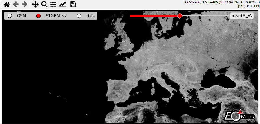
WebMap services and layer-switching
add WebMap services using
m.add_wmsandm.add_wmtscompare different data-layers and WebMap services using
m.cb.click.peek_layerandm.cb.keypress.switch_layer
# EOmaps example: WebMap services and layer-switching

from eomaps import Maps
import numpy as np
import pandas as pd

# ------ create some data --------
lon, lat = np.meshgrid(np.linspace(-50, 50, 150), np.linspace(30, 60, 150))
data = pd.DataFrame(
    dict(lon=lon.flat, lat=lat.flat, data=np.sqrt(lon**2 + lat**2).flat)
)
# --------------------------------

m = Maps(Maps.CRS.GOOGLE_MERCATOR, layer="S1GBM_vv", figsize=(9, 4))
# set the crs to GOOGLE_MERCATOR to avoid reprojecting the WebMap data
# (makes it a lot faster and it will also look much nicer!)

# add S1GBM WebMap to the layer of this Maps-object
m.add_wms.S1GBM.add_layer.vv()

# add OpenStreetMap on the currently invisible layer (OSM)
m.add_wms.OpenStreetMap.add_layer.default(layer="OSM")

# create a new layer named "data" and plot some data
m2 = m.new_layer(layer="data")
m2.set_data(data=data.sample(5000), x="lon", y="lat", crs=4326)
m2.set_shape.geod_circles(radius=20000)
m2.plot_map()


# -------- CALLBACKS ----------
# (use m.all to execute independent of the visible layer)
# on a left-click, show layers ("data", "OSM") in a rectangle
m.all.cb.click.attach.peek_layer(layer="OSM|data", how=0.2)

# on a right-click, "swipe" the layers ("S1GBM_vv" and "data") from the left
m.all.cb.click.attach.peek_layer(
    layer="S1GBM_vv|data",
    how="left",
    button=3,
)

# switch between the layers by pressing the keys 0, 1 and 2
m.all.cb.keypress.attach.switch_layer(layer="S1GBM_vv", key="0")
m.all.cb.keypress.attach.switch_layer(layer="OSM", key="1")
m.all.cb.keypress.attach.switch_layer(layer="data", key="2")

# add a pick callback that is only executed if the "data" layer is visible
m2.cb.pick.attach.annotate(zorder=100)  # use a high zorder to put it on top

# ------ UTILITY WIDGETS --------
# add a clickable widget to switch between layers
m.util.layer_selector(
    loc="upper left",
    ncol=3,
    bbox_to_anchor=(0.01, 0.99),
    layers=["OSM", "S1GBM_vv", "data"],
)
# add a slider to switch between layers
s = m.util.layer_slider(
    pos=(0.5, 0.93, 0.38, 0.025),
    color="r",
    handle_style=dict(facecolor="r"),
    txt_patch_props=dict(fc="w", ec="none", alpha=0.75, boxstyle="round, pad=.25"),
)

# explicitly set the layers you want to use in the slider
# (Note: you can also use combinations of multiple existing layers!)
s.set_layers(["OSM", "S1GBM_vv", "data", "OSM|data{0.5}"])

# ------------------------------

m.add_logo()

m.apply_layout(
    {
        "figsize": [9.0, 4.0],
        "0_map": [0.00625, 0.01038, 0.9875, 0.97924],
        "1_slider": [0.45, 0.93, 0.38, 0.025],
        "2_logo": [0.865, 0.02812, 0.12, 0.11138],
    }
)

# fetch all layers before startup so that they are already cached
m.fetch_layers()
- The data displayed in the above gif is taken from:
Sentinel-1 Global Backscatter Model (https://researchdata.tuwien.ac.at/records/n2d1v-gqb91)
OpenStreetMap hosted by Mundialis (https://www.mundialis.de/en/ows-mundialis/)
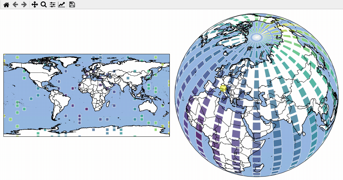
Vector data - interactive geometries
EOmaps can be used to assign callbacks to vektor-data (e.g. geopandas.GeoDataFrames).
to make a GeoDataFrame pickable, first use
m.add_gdf(picker_name="MyPicker")now you can assign callbacks via
m.cb.pick__MyPicker.attach...just as you would do with the ordinarym.cb.clickorm.cb.pickcallbacks
Note
For large datasets that are visualized as simple rectangles, ellipses etc.
it is recommended to use EOmaps to visualize the data with m.plot_map()
since the generation of the plot and the identification of the picked pixels
will be much faster!
If the GeoDataFrame contains multiple different geometry types (e.g. Lines, Patches, etc.) a unique pick-collection will be assigned for each of the geometry types!
# EOmaps example: Using geopandas - interactive shapes!

from eomaps import Maps
import pandas as pd
import numpy as np

# geopandas is used internally... the import is just here to show that!
import geopandas as gpd

# ----------- create some example-data
lon, lat = np.meshgrid(np.linspace(-180, 180, 25), np.linspace(-90, 90, 25))
data = pd.DataFrame(
    dict(lon=lon.flat, lat=lat.flat, data=np.sqrt(lon**2 + lat**2).flat)
)

# setup 2 maps with different projections next to each other
m = Maps(ax=121, crs=4326, figsize=(10, 5))
m2 = Maps(f=m.f, ax=122, crs=Maps.CRS.Orthographic(45, 45))

# assign data to the Maps objects
m.set_data(data=data.sample(100), x="lon", y="lat", crs=4326, parameter="data")
m2.set_data(data=data, x="lon", y="lat", crs=4326)

# fetch data (incl. metadata) for the "admin_0_countries" NaturalEarth feature
countries = m.add_feature.cultural.admin_0_countries.get_gdf(scale=50)

for m_i in [m, m2]:
    m_i.add_feature.preset.ocean()

    m_i.add_gdf(
        countries,
        picker_name="countries",
        pick_method="contains",
        val_key="NAME",
        fc="none",
        ec="k",
        lw=0.5,
    )

    m_i.set_shape.rectangles(radius=3, radius_crs=4326)
    m_i.plot_map(alpha=0.75, ec=(1, 1, 1, 0.5))

    # attach a callback to highlite the rectangles
    m_i.cb.pick.attach.mark(shape="rectangles", fc="none", ec="b", lw=2)

    # attach a callback to highlite the countries and indicate the names
    picker = m_i.cb.pick["countries"]
    picker.attach.highlight_geometry(fc="r", ec="k", lw=0.5, alpha=0.5)
    picker.attach.annotate(text=lambda val, **kwargs: str(val))

# share pick events between the maps-objects
m.cb.pick.share_events(m2)
m.cb.pick["countries"].share_events(m2)

m.add_logo()
m.apply_layout(
    {
        "figsize": [10.0, 5.0],
        "0_map": [0.005, 0.25114, 0.5, 0.5],
        "1_map": [0.5125, 0.0375, 0.475, 0.95],
        "2_logo": [0.875, 0.01, 0.12, 0.09901],
    }
)
- The data displayed in the above gif is taken from:
NaturalEarth (https://www.naturalearthdata.com/)
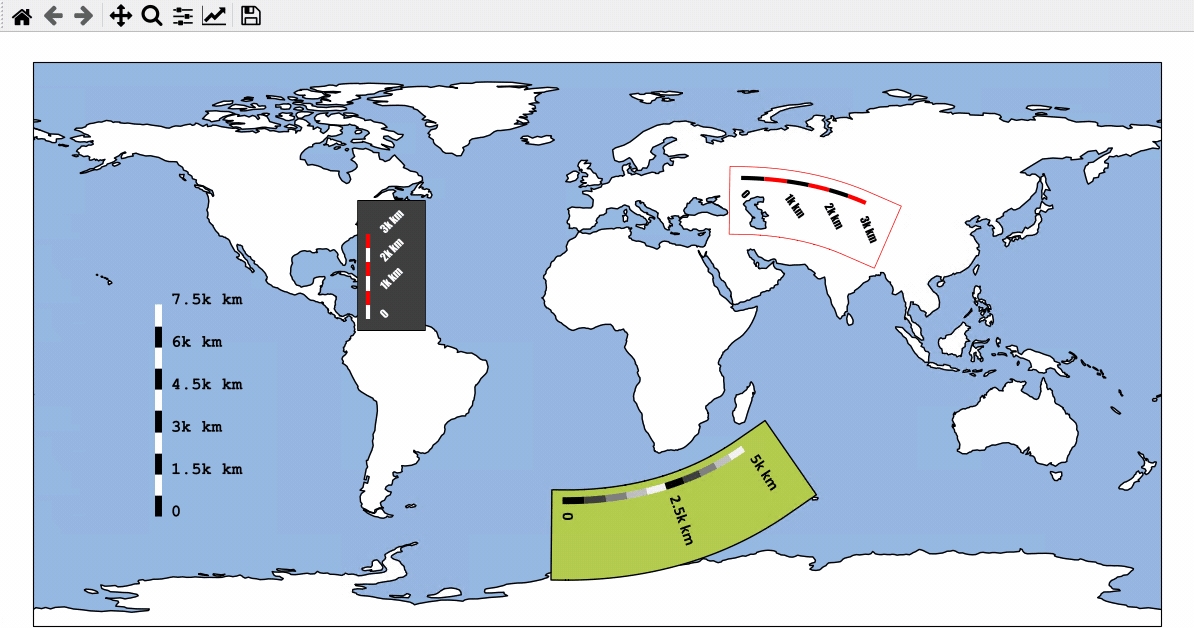
Using Scalebars
- EOmaps has a nice customizable scalebar feature!
use
s = m.add_scalebar(lon, lat, azim)to attach a scalebar to the plotonce the scalebar is there, you can drag it around and change its properties via
s.set_position,s.set_scale_props(),s.set_label_props()ands.set_patch_props()
Note
You can also simply drag the scalebar with the mouse!
LEFT-click on it to make it interactive!
RIGHT-click anywhere on the map to make it fixed again
There are also some useful keyboard shortcuts you can use while the scalebar is interactive
use
+/-to rotate the scalebaruse
alt++/-to set the text-offsetuse the
arrow-keysto increase the frame-widthsuse
alt+arrow-keysto decrease the frame-widthsuse
deleteto remove the scalebar from the plot
# EOmaps example: Adding scalebars - what about distances?

from eomaps import Maps

m = Maps(figsize=(9, 5))
m.add_feature.preset.ocean(ec="k", scale="110m")

s1 = m.add_scalebar((0, 45), 30, scale=10e5, n=8, preset="kr")

s2 = m.add_scalebar(
    (-11, -50),
    -45,
    scale=5e5,
    n=10,
    scale_props=dict(width=5, colors=("k", ".25", ".5", ".75", ".95")),
    patch_props=dict(offsets=(1, 1.4, 1, 1), fc=(0.7, 0.8, 0.3, 1)),
    label_props=dict(offset=0.5, scale=1.4, every=5, weight="bold", family="Calibri"),
)

s3 = m.add_scalebar(
    (-120, -20),
    0,
    scale=5e5,
    n=10,
    scale_props=dict(width=3, colors=(*["w", "darkred"] * 2, *["w"] * 5, "darkred")),
    patch_props=dict(fc=(0.25, 0.25, 0.25, 0.8), ec="k", lw=0.5, offsets=(1, 1, 1, 2)),
    label_props=dict(
        every=(1, 4, 10), color="w", rotation=45, weight="bold", family="Impact"
    ),
    line_props=dict(color="w"),
)

# it's also possible to update the properties of an existing scalebar
# via the setter-functions!
s4 = m.add_scalebar(n=10, preset="bw")
s4.set_scale_props(width=3, colors=[(1, 0.6, 0), (0, 0.5, 0.5)])
s4.set_label_props(every=2)

# NOTE that the last scalebar (s4) is automatically re-scaled and re-positioned
#      on zoom events (the default if you don't provide an explicit scale & position)!

m.add_logo()
- The data displayed in the above gif is taken from:
NaturalEarth (https://www.naturalearthdata.com/)
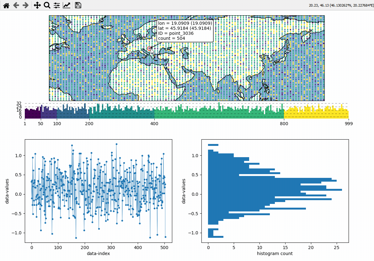
Data analysis widgets - Timeseries and histograms
Callback-functions can be used to trigger updates on other plots. This example shows how to use EOmaps to analyze a database that is associated with a map.
create a grid of
Mapsobjects and ordinary matplotlib axes viaMapsGriddefine a custom callback to update the plots if you click on the map
# EOmaps example:  Data analysis widgets - Interacting with a database

from eomaps import Maps
import pandas as pd
import numpy as np

# ============== create a random database =============
length, Nlon, Nlat = 1000, 100, 50
lonmin, lonmax, latmin, latmax = -70, 175, 0, 75

database = np.full((Nlon * Nlat, length), np.nan)
for i in range(Nlon * Nlat):
    size = np.random.randint(1, length)
    x = np.random.normal(loc=np.random.rand(), scale=np.random.rand(), size=size)
    np.put(database, range(i * length, i * length + size), x)
lon, lat = np.meshgrid(
    np.linspace(lonmin, lonmax, Nlon), np.linspace(latmin, latmax, Nlat)
)

IDs = [f"point_{i}" for i in range(Nlon * Nlat)]
database = pd.DataFrame(database, index=IDs)
coords = pd.DataFrame(dict(lon=lon.flat, lat=lat.flat), index=IDs)

# -------- calculate the number of values in each dataset
#          (e.g. the data actually shown on the map)
data = pd.DataFrame(dict(count=database.count(axis=1), **coords))
# =====================================================


# initialize a map on top
m = Maps(ax=211)
m.add_feature.preset.ocean()
m.add_feature.preset.coastline()

# initialize 2 matplotlib plot-axes below the map
ax_left = m.f.add_subplot(223)
ax_left.set_ylabel("data-values")
ax_left.set_xlabel("data-index")

ax_right = m.f.add_subplot(224)
ax_right.set_ylabel("data-values")
ax_right.set_xlabel("histogram count")

ax_left.sharey(ax_right)

# -------- assign data to the map and plot it
m.set_data(data=data, x="lon", y="lat", crs=4326)
m.set_classify_specs(
    scheme=Maps.CLASSIFIERS.UserDefined,
    bins=[50, 100, 200, 400, 800],
)
m.set_shape.ellipses(radius=0.5)
m.plot_map()


# -------- define a custom callback function to update the plots
def update_plots(ID, **kwargs):
    # get the data
    x = database.loc[ID].dropna()

    # plot the lines and histograms
    (l,) = ax_left.plot(x, lw=0.5, marker=".", c="C0")
    cnt, val, art = ax_right.hist(x.values, bins=50, orientation="horizontal", fc="C0")

    # re-compute axis limits based on the new artists
    ax_left.relim()
    ax_right.relim()
    ax_left.autoscale()
    ax_right.autoscale()

    # add all artists as "temporary pick artists" so that they
    # are removed when the next datapoint is selected
    for a in [l, *art]:
        m.cb.pick.add_temporary_artist(a)


# attach the custom callback (and some pre-defined callbacks)
m.cb.pick.attach(update_plots)
m.cb.pick.attach.annotate()
m.cb.pick.attach.mark(permanent=False, buffer=1, fc="none", ec="r")
m.cb.pick.attach.mark(permanent=False, buffer=2, fc="none", ec="r", ls=":")

# add a colorbar
m.add_colorbar(0.25, label="Number of observations")
m.colorbar.ax_cb_plot.tick_params(labelsize=6)

# add a logo
m.add_logo()

m.apply_layout(
    {
        "figsize": [6.4, 4.8],
        "0_map": [0.05625, 0.60894, 0.8875, 0.36594],
        "1_": [0.12326, 0.11123, 0.35, 0.31667],
        "2_": [0.58674, 0.11123, 0.35, 0.31667],
        "3_cb": [0.12, 0.51667, 0.82, 0.06166],
        "3_cb_histogram_size": 0.8,
        "4_logo": [0.8125, 0.62333, 0.1212, 0.06667],
    }
)
Data analysis widgets - Select 1D slices of a 2D dataset
Use custom callback functions to perform arbitrary tasks on the data when clicking on the map.
Identify clicked row/col in a 2D dataset
Highlight the found row and column using a new layer
(requires EOmaps >= v3.1.4)
# EOmaps example: Select 1D slices of a 2D dataset

from eomaps import Maps
import numpy as np

# setup some random 2D data
lon, lat = np.meshgrid(np.linspace(-180, 180, 200), np.linspace(-90, 90, 100))
data = np.sqrt(lon**2 + lat**2) + np.random.normal(size=lat.shape) ** 2 * 20
name = "some parameter"
# ----------------------

# create a new map spanning the left row of a 2x2 grid
m = Maps(crs=Maps.CRS.InterruptedGoodeHomolosine(), ax=(2, 2, (1, 3)), figsize=(8, 5))
m.add_feature.preset.coastline()
m.set_data(data, lon, lat, parameter=name)
m.set_classify_specs(Maps.CLASSIFIERS.NaturalBreaks, k=5)
m.plot_map()

# create 2 ordinary matplotlib axes to show the selected data
ax_row = m.f.add_subplot(222)  # 2x2 grid, top right
ax_row.set_xlabel("Longitude")
ax_row.set_ylabel(name)
ax_row.set_xlim(-185, 185)
ax_row.set_ylim(data.min(), data.max())

ax_col = m.f.add_subplot(224)  #  2x2 grid, bottom right
ax_col.set_xlabel("Latitude")
ax_col.set_ylabel(name)
ax_col.set_xlim(-92.5, 92.5)
ax_col.set_ylim(data.min(), data.max())

# add a colorbar for the data
m.add_colorbar(label=name)
m.colorbar.ax_cb.tick_params(rotation=90)  # rotate colorbar ticks 90°

# add new layers to plot row- and column data
m2 = m.new_layer()
m2.set_shape.ellipses(m.shape.radius)

m3 = m.new_layer()
m3.set_shape.ellipses(m.shape.radius)


# define a custom callback to indicate the clicked row/column
def cb(m, ind, ID, *args, **kwargs):
    # get row and column from the data
    # NOTE: "ind" always represents the index of the flattened array!
    r, c = np.unravel_index(ind, m.data.shape)

    # ---- highlight the picked column
    # use "dynamic=True" to avoid re-drawing the background on each pick
    # use "set_extent=False" to avoid resetting the plot extent on each draw
    m2.set_data(m.data_specs.data[:, c], m.data_specs.x[:, c], m.data_specs.y[:, c])
    m2.plot_map(fc="none", ec="b", set_extent=False, dynamic=True)

    # ---- highlight the picked row
    m3.set_data(m.data_specs.data[r, :], m.data_specs.x[r, :], m.data_specs.y[r, :])
    m3.plot_map(fc="none", ec="r", set_extent=False, dynamic=True)

    # ---- plot the data for the selected column
    (art0,) = ax_col.plot(m.data_specs.y[:, c], m.data_specs.data[:, c], c="b")
    (art01,) = ax_col.plot(
        m.data_specs.y[r, c],
        m.data_specs.data[r, c],
        c="k",
        marker="o",
        markerfacecolor="none",
        ms=10,
    )

    # ---- plot the data for the selected row
    (art1,) = ax_row.plot(m.data_specs.x[r, :], m.data_specs.data[r, :], c="r")
    (art11,) = ax_row.plot(
        m.data_specs.x[r, c],
        m.data_specs.data[r, c],
        c="k",
        marker="o",
        markerfacecolor="none",
        ms=10,
    )

    # make all artists temporary (e.g. remove them on next pick)
    # "m2.coll" represents the collection created by "m2.plot_map()"
    for a in [art0, art01, art1, art11, m2.coll, m3.coll]:
        m.cb.pick.add_temporary_artist(a)


# attach the custom callback
m.cb.pick.attach(cb, m=m)

# ---- add a pick-annotation with a custom text
def text(ind, val, **kwargs):
    r, c = np.unravel_index(ind, m.data.shape)
    return (
        f"row/col = {r}/{c}\n"
        f"lon/lat = {m.data_specs.x[r, c]:.2f}/{m.data_specs.y[r, c]:.2f}\n"
        f"val = {val:.2f}"
    )


m.cb.pick.attach.annotate(text=text, fontsize=7)

# apply a previously arranged layout (e.g. check "layout-editor" in the docs!)
m.apply_layout(
    {
        "figsize": [8, 5],
        "0_map": [0.015, 0.49253, 0.51, 0.35361],
        "1_": [0.60375, 0.592, 0.38, 0.392],
        "2_": [0.60375, 0.096, 0.38, 0.392],
        "3_cb": [0.025, 0.144, 0.485, 0.28],
        "3_cb_histogram_size": 0.8,
    }
)
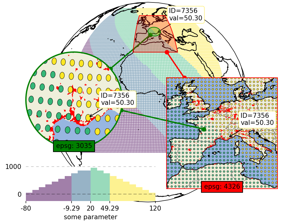
Inset-maps - get a zoomed-in view on selected areas
Quickly create nice inset-maps to show details for specific regions.
the location and extent of the inset can be defined in any given crs
(or as a geodesic circle with a radius defined in meters)
the inset-map can have a different crs than the “parent” map
(requires EOmaps >= v4.1)
# EOmaps example: How to create inset-maps

from eomaps import Maps
import numpy as np

m = Maps(Maps.CRS.Orthographic())
m.add_feature.preset.coastline()  # add some coastlines

# ---------- create a new inset-map
#            showing a 15 degree rectangle around the xy-point
mi1 = m.new_inset_map(
    xy=(5, 45),
    xy_crs=4326,
    shape="rectangles",
    radius=15,
    plot_position=(0.75, 0.4),
    plot_size=0.5,
    inset_crs=4326,
    boundary=dict(ec="r", lw=1),
    indicate_extent=dict(fc=(1, 0, 0, 0.25)),
)

mi1.add_indicator_line(m, marker="o")

# populate the inset with some more detailed features
mi1.add_feature.preset("coastline", "ocean", "land", "countries", "urban_areas")

# ---------- create another inset-map
#            showing a 400km circle around the xy-point
mi2 = m.new_inset_map(
    xy=(5, 45),
    xy_crs=4326,
    shape="geod_circles",
    radius=400000,
    plot_position=(0.25, 0.4),
    plot_size=0.5,
    inset_crs=3035,
    boundary=dict(ec="g", lw=2),
    indicate_extent=dict(fc=(0, 1, 0, 0.25)),
)
mi2.add_indicator_line(m, marker="o")

# populate the inset with some features
mi2.add_feature.preset("ocean", "land")
mi2.add_feature.preset.urban_areas(zorder=1)

# print some data on all of the maps

x, y = np.meshgrid(np.linspace(-50, 50, 100), np.linspace(-30, 70, 100))
data = x + y

m.set_data(data, x, y, crs=4326)
m.set_classify.Quantiles(k=4)
m.plot_map(alpha=0.5, ec="none", set_extent=False)

# use the same data and classification for the inset-maps
for m_i in [mi1, mi2]:
    m_i.inherit_data(m)
    m_i.inherit_classification(m)

mi1.set_shape.ellipses(np.mean(m.shape.radius) / 2)
mi1.plot_map(alpha=0.75, ec="k", lw=0.5, set_extent=False)

mi2.set_shape.ellipses(np.mean(m.shape.radius) / 2)
mi2.plot_map(alpha=1, ec="k", lw=0.5, set_extent=False)


# add an annotation for the second datapoint to the inset-map
mi2.add_annotation(ID=1, xytext=(-120, 80))

# indicate the extent of the second inset on the first inset
mi2.add_extent_indicator(mi1, ec="g", lw=2, fc="g", alpha=0.5, zorder=0)
mi2.add_indicator_line(mi1, marker="o")

# add some additional text to the inset-maps
for m_i, txt, color in zip([mi1, mi2], ["epsg: 4326", "epsg: 3035"], ["r", "g"]):
    txt = m_i.ax.text(
        0.5,
        0,
        txt,
        transform=m_i.ax.transAxes,
        horizontalalignment="center",
        bbox=dict(facecolor=color),
    )
    # add the text-objects as artists to the blit-manager
    m_i.BM.add_artist(txt)

mi2.add_colorbar(hist_bins=20, margin=dict(bottom=-0.2), label="some parameter")
# move the inset map (and the colorbar) to a different location
mi2.set_inset_position(x=0.3)

# share pick events
for mi in [m, mi1, mi2]:
    mi.cb.pick.attach.annotate(text=lambda ID, val, **kwargs: f"ID={ID}\nval={val:.2f}")
m.cb.pick.share_events(mi1, mi2)

m.apply_layout(
    {
        "figsize": [6.4, 4.8],
        "0_map": [0.1625, 0.09, 0.675, 0.9],
        "1_inset_map": [0.5625, 0.15, 0.375, 0.5],
        "2_inset_map": [0.0875, 0.33338, 0.325, 0.43225],
        "3_cb": [0.0875, 0.12, 0.4375, 0.12987],
        "3_cb_histogram_size": 0.8,
    }
)
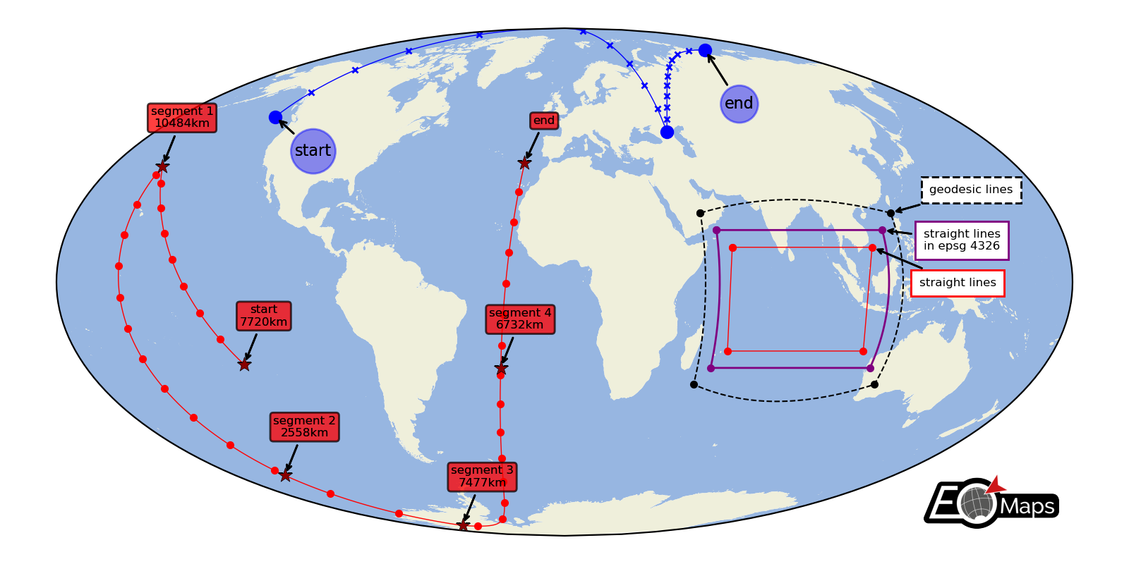
Lines and Annotations
Draw lines defined by a set of anchor-points and add some nice annotations.
Connect the anchor-points via:
geodesic lines
straight lines
reprojected straight lines defined in a given projection
(requires EOmaps >= v4.3.1)
# EOmaps example: drawing lines on a map

from eomaps import Maps

m = Maps(Maps.CRS.Mollweide(), figsize=(8, 4))
m.add_feature.preset.ocean()
m.add_feature.preset.land()

# get a few points for some basic lines
l1 = [(-135, 50), (45, 45), (123, 76)]
l2 = [(-120, -24), (-160, 34), (-153, -60), (-128, -82), (-24, -25), (-16, 35)]

# define annotation-styles
bbox_style1 = dict(
    xy_crs=4326,
    fontsize=8,
    bbox=dict(boxstyle="circle,pad=0.25", ec="b", fc="b", alpha=0.25),
)
bbox_style2 = dict(
    xy_crs=4326,
    fontsize=6,
    bbox=dict(boxstyle="round,pad=0.25", ec="k", fc="r", alpha=0.5),
    horizontalalignment="center",
)

# -------- draw a line with 100 intermediate points per line-segment,
#          mark anchor-points with "o" and every 10th intermediate point with "x"
m.add_line(l1, c="b", lw=0.5, marker="x", ms=3, markevery=10, n=100, mark_points="bo")

m.add_annotation(xy=l1[0], text="start", xytext=(10, -20), **bbox_style1)
m.add_annotation(xy=l1[-1], text="end", xytext=(10, -30), **bbox_style1)

# -------- draw a line with ~1km spacing between intermediate points per line-segment,
#          mark anchor-points with "*" and every 1000th intermediate point with "."

d_inter, d_tot = m.add_line(
    l2,
    c="r",
    lw=0.5,
    marker=".",
    del_s=1000,
    markevery=1000,
    mark_points=dict(marker="*", fc="darkred", ec="k", lw=0.25, s=60, zorder=99),
)

for i, (point, distance) in enumerate(zip(l2[:-1], d_tot)):
    if i == 0:
        t = "start"
    else:
        t = f"segment {i}"

    m.add_annotation(
        xy=point, text=f"{t}\n{distance/1000:.0f}km", xytext=(10, 20), **bbox_style2
    )

m.add_annotation(xy=l2[-1], text="end", xytext=(10, 20), **bbox_style2)


# -------- show the effect of different connection-styles

l3 = [(50, 20), (120, 20), (120, -30), (50, -30), (50, 20)]
l4 = [(55, 15), (115, 15), (115, -25), (55, -25), (55, 15)]
l5 = [(60, 10), (110, 10), (110, -20), (60, -20), (60, 10)]

# -------- connect points via straight lines
m.add_line(l3, lw=0.75, ls="--", c="k", mark_points="k.")
m.add_annotation(
    xy=l3[1],
    fontsize=6,
    xy_crs=4326,
    text="geodesic lines",
    xytext=(20, 10),
    bbox=dict(ec="k", fc="w", ls="--"),
)

# -------- connect points via lines that are straight in a given projection
m.add_line(
    l4,
    connect="straight_crs",
    xy_crs=4326,
    lw=1,
    c="purple",
    mark_points=dict(fc="purple", marker="."),
)
m.add_annotation(
    xy=l4[1],
    fontsize=6,
    xy_crs=4326,
    text="straight lines\nin epsg 4326",
    xytext=(21, -10),
    bbox=dict(ec="purple", fc="w"),
)

# -------- connect points via geodesic lines
m.add_line(l5, connect="straight", lw=0.5, c="r", mark_points="r.")

m.add_annotation(
    xy=l5[1],
    fontsize=6,
    xy_crs=4326,
    text="straight lines",
    xytext=(24, -20),
    bbox=dict(ec="r", fc="w"),
)

m.add_logo()
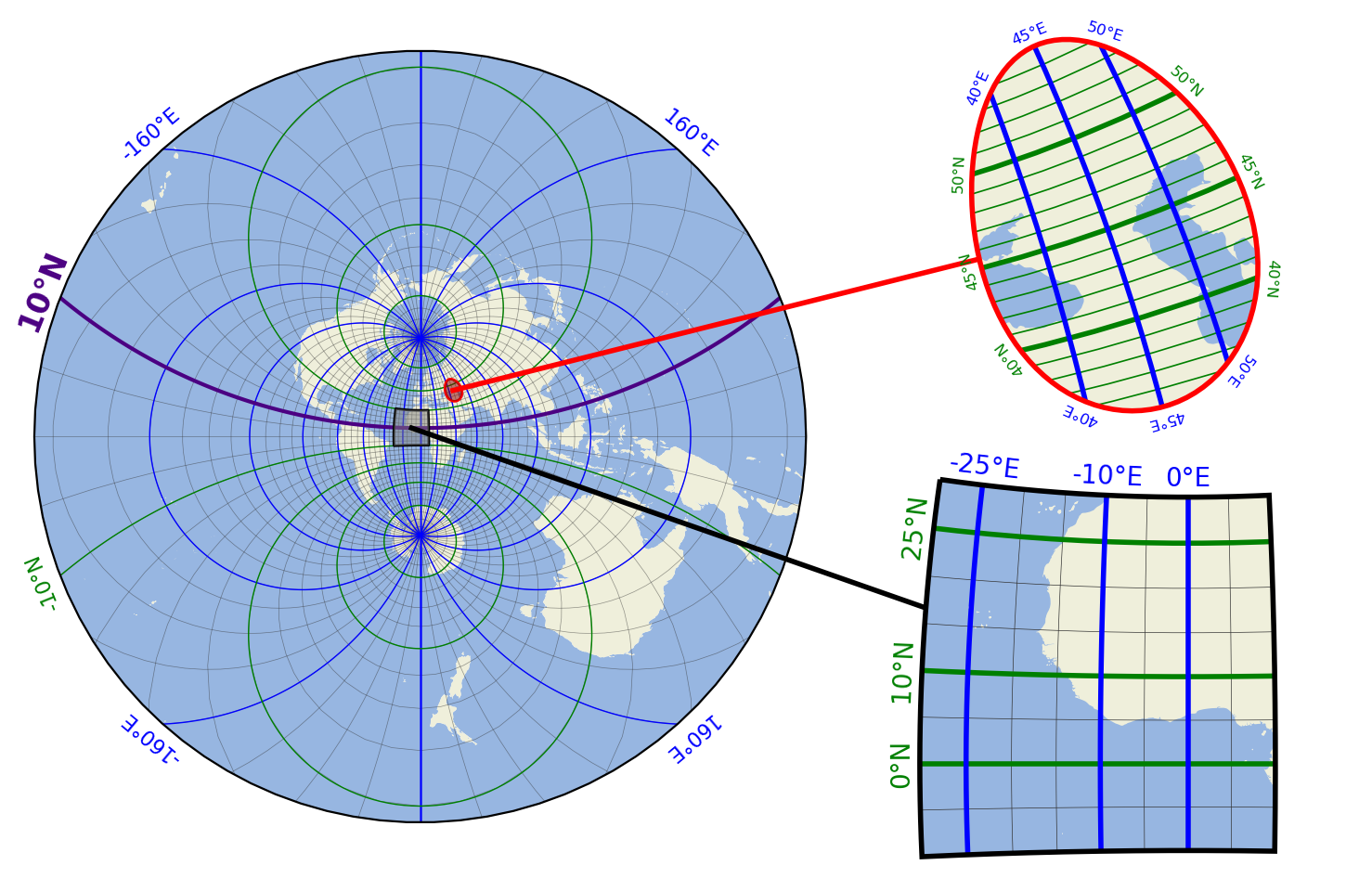
Gridlines and Grid Labels
Draw custom grids and add grid labels.
(requires EOmaps >= v6.5)
# EOmaps example:  Customized gridlines

from eomaps import Maps

m = Maps(crs=Maps.CRS.Stereographic())
m.subplots_adjust(left=0.1, right=0.9, bottom=0.1, top=0.9)

m.add_feature.preset.ocean()
m.add_feature.preset.land()

# draw a regular 5 degree grid
m.add_gridlines(5, lw=0.25, alpha=0.5)
# draw a grid with 20 degree longitude spacing and add labels
g = m.add_gridlines((20, None), c="b", n=500)
g.add_labels(offset=10, fontsize=8, c="b")
# draw a grid with 20 degree latitude spacing, add labels and exclude the 10° tick
g = m.add_gridlines((None, 20), c="g", n=500)
g.add_labels(where="l", offset=10, fontsize=8, c="g", exclude=[10])
# explicitly highlight 10°N line and add a label on one side of the map
g = m.add_gridlines((None, [10]), c="indigo", n=500, lw=1.5)
g.add_labels(where="l", fontsize=12, fontweight="bold", c="indigo")


# ----------------- first inset-map
mi = m.new_inset_map(xy=(45, 45), radius=10, inset_crs=m.crs_plot)
mi.add_feature.preset.ocean()
mi.add_feature.preset.land()

# draw a regular 1 degree grid
g = mi.add_gridlines((None, 1), c="g", lw=0.6)
# add some specific latitude gridlines and add labels
g = mi.add_gridlines((None, [40, 45, 50]), c="g", lw=2)
g.add_labels(where="lr", offset=7, fontsize=6, c="g")
# add some specific longitude gridlines and add labels
g = mi.add_gridlines(([40, 45, 50], None), c="b", lw=2)
g.add_labels(where="tb", offset=7, fontsize=6, c="b")

mi.add_extent_indicator(m, fc="darkred", ec="none", alpha=0.5)
mi.add_indicator_line()

# ----------------- second inset-map
mi = m.new_inset_map(
    inset_crs=m.crs_plot,
    xy=(-10, 10),
    radius=20,
    shape="rectangles",
    boundary=dict(ec="k"),
)
mi.add_feature.preset.ocean()
mi.add_feature.preset.land()

mi.add_extent_indicator(m, fc=".5", ec="none", alpha=0.5)
mi.add_indicator_line(c="k")

# draw a regular 1 degree grid
g = mi.add_gridlines(5, lw=0.25)
# add some specific latitude gridlines and add labels
g = mi.add_gridlines((None, [0, 10, 25]), c="g", lw=2)
g.add_labels(where="l", fontsize=10, c="g")
# add some specific longitude gridlines and add labels
g = mi.add_gridlines(([-25, -10, 0], None), c="b", lw=2)
g.add_labels(where="t", fontsize=10, c="b")

m.apply_layout(
    {
        "figsize": [7.39, 4.8],
        "0_map": [0.025, 0.07698, 0.5625, 0.86602],
        "1_inset_map": [0.7, 0.53885, 0.225, 0.41681],
        "2_inset_map": [0.6625, 0.03849, 0.275, 0.42339],
    }
)
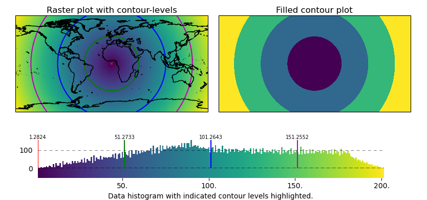
Contour plots and Contour Levels
Use the contour-shape to draw contour-plots of regular (or irregular data)
or to indicate contour-levels on top of other plots.
(requires EOmaps >= v7.1)
# EOmaps example:  Contour plots and contour levels

from eomaps import Maps
import numpy as np

# ------------- setup some random data
lon, lat = np.meshgrid(np.linspace(-180, 180, 200), np.linspace(-90, 90, 100))
data = np.sqrt(lon**2 + lat**2)
name = "some parameter"

# ------------- left map
m = Maps(ax=121)
m.add_title("Raster plot with contour-levels")
m.add_feature.preset.coastline()
# plot raster-data
m.set_data(data, lon, lat, parameter=name)
m.set_shape.raster()
m.plot_map()

# layer to indicate contour-levels
m_cont = m.new_layer(inherit_data=True)
m_cont.set_shape.contour(filled=False)
m_cont.set_classify.EqualInterval(k=4)
m_cont.plot_map(colors=("r", "g", "b", "m"))

# ------------- right map
m2 = m.new_map(ax=122, inherit_data=True)
m2.add_title("Filled contour plot")
m2.set_classify.EqualInterval(k=4)
m2.set_shape.contour(filled=True)
m2.plot_map(cmap="viridis")

# add a colorbar and indicate contour-levels
cb = m.add_colorbar(label="Data histogram with indicated contour levels highlighted.")
cb.indicate_contours(m_cont)

# apply a customized layout
layout = {
    "figsize": [8.34, 3.9],
    "0_map": [0.03652, 0.44167, 0.45, 0.48115],
    "1_map": [0.51152, 0.44167, 0.45, 0.48115],
    "2_cb": [-0.0125, 0.02673, 1.0125, 0.28055],
    "2_cb_histogram_size": 0.76,
}
m.apply_layout(layout)