🌐 EOmaps examples
… a collection of examples that show how to create beautiful interactive maps.
🐣 Quickly visualize your data
There are 3 basic steps required to visualize your data:
Initialize a Maps-object with
m = Maps()Set the data and its specifications via
m.set_data(orm.set_data_specs)Call
m.plot_map()to generate the map!
# EOmaps example 1:
from eomaps import Maps
import pandas as pd
import numpy as np

# ----------- create some example-data
lon, lat = np.meshgrid(np.arange(-20, 40, 0.25), np.arange(30, 60, 0.25))
data = pd.DataFrame(
    dict(lon=lon.flat, lat=lat.flat, data_variable=np.sqrt(lon**2 + lat**2).flat)
)
data = data.sample(15000)  # take 15000 random datapoints from the dataset
# ------------------------------------

m = Maps(crs=4326)
m.add_feature.preset.ocean()
m.add_feature.preset.coastline()
m.set_data(
    data=data,  # a pandas-DataFrame holding the data & coordinates
    parameter="data_variable",  # the DataFrame-column you want to plot
    x="lon",  # the name of the DataFrame-column representing the x-coordinates
    y="lat",  # the name of the DataFrame-column representing the y-coordinates
    crs=4326,
)  # the coordinate-system of the x- and y- coordinates
m.plot_map()
m.add_colorbar()

c = m.add_compass((0.05, 0.86), scale=7, patch=None)

m.cb.pick.attach.annotate()  # attach a basic pick-annotation (on left-click)
m.add_logo()  # add a logo
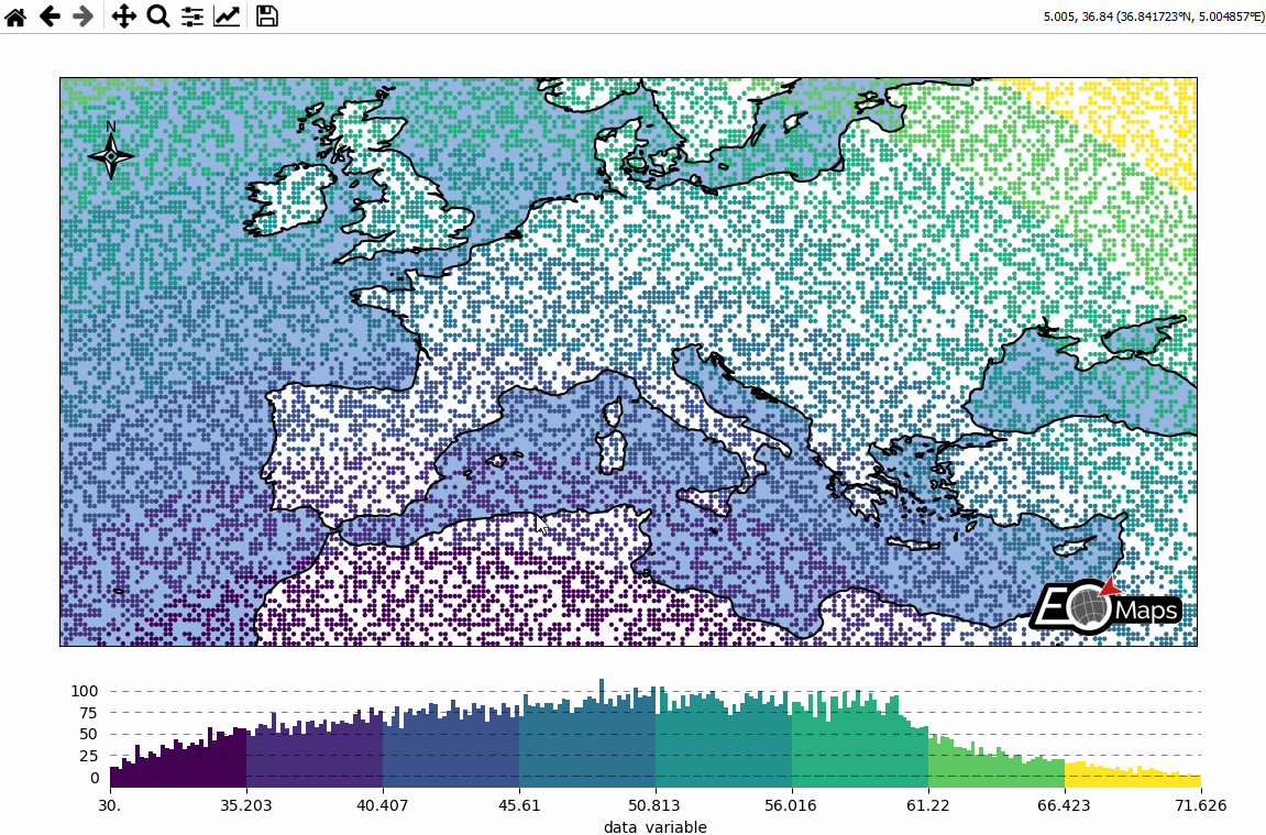
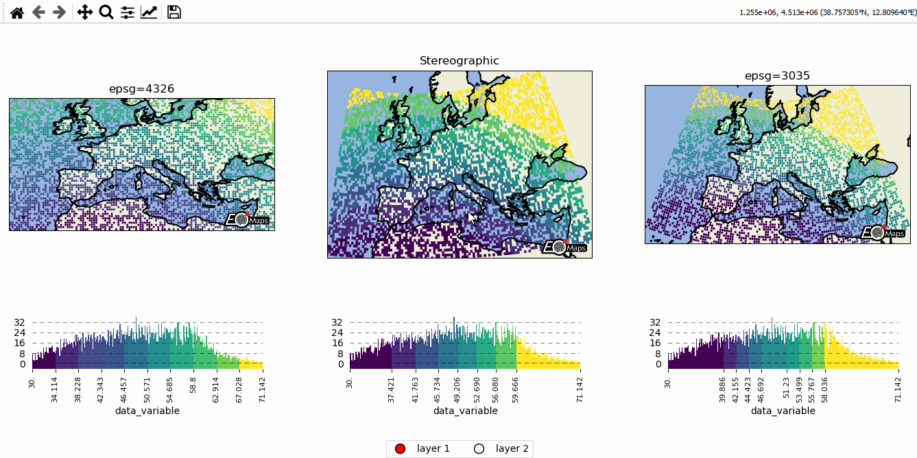
🌍 Data-classification and multiple Maps in one figure
Create grids of maps via
MapsGrid- Classify your data via
m.set_classify_specs(scheme, **kwargs)(using classifiers provided by themapclassifymodule) - Add individual callback functions to each subplot via
m.cb.click.attach,m.cb.pick.attach - Share events between Maps-objects of the MapsGrid via
mg.share_click_events()andmg.share_pick_events()
# EOmaps example 2: Data-classification and multiple Maps in one figure

from eomaps import MapsGrid, Maps
import pandas as pd
import numpy as np

# ----------- create some example-data
lon, lat = np.meshgrid(np.arange(-20, 40, 0.5), np.arange(30, 60, 0.5))
data = pd.DataFrame(
    dict(lon=lon.flat, lat=lat.flat, data_variable=np.sqrt(lon**2 + lat**2).flat)
)
data = data.sample(4000)  # take 4000 random datapoints from the dataset
# ------------------------------------

# initialize a grid of Maps objects
mg = MapsGrid(
    1,
    3,
    crs=[4326, Maps.CRS.Stereographic(), 3035],
    figsize=(11, 5),
    bottom=0.15,
    layer="layer 1",
)
# set the data on ALL maps-objects of the grid
mg.set_data(data=data, x="lon", y="lat", in_crs=4326)

# --------- set specs for the first axis
mg.m_0_0.ax.set_title("epsg=4326")
mg.m_0_0.set_classify_specs(scheme="EqualInterval", k=10)

# --------- set specs for the second axis
mg.m_0_1.ax.set_title("Stereographic")
mg.m_0_1.set_shape.rectangles()
mg.m_0_1.set_classify_specs(scheme="Quantiles", k=8)

# --------- set specs for the third axis
mg.m_0_2.ax.set_extent(mg.m_0_2.crs_plot.area_of_use.bounds)

mg.m_0_2.ax.set_title("epsg=3035")
mg.m_0_2.set_classify_specs(
    scheme="StdMean",
    multiples=[-1, -0.75, -0.5, -0.25, 0.25, 0.5, 0.75, 1],
)

# --------- plot all maps and add colorbars to all maps
mg.plot_map()
mg.add_colorbar()

# use cartopy to reproject the ocean to avoid glitches
mg.add_feature.preset.ocean()
mg.add_feature.preset.land()
mg.add_feature.preset.coastline(layer="all")  # add the coastline to all layers

# --------- add a new layer for the second axis
# (simply re-plot the data with a different classification and plot-shape)

# NOTE: this layer is not visible by default but it can be shown by clicking
# on the layer-switcher utility buttons (bottom center of the figure)
# or by using `m2.show()`   or via  `m.show_layer("layer 2")`
m2 = mg.m_0_1.new_layer(layer="layer 2", copy_data_specs=True)
m2.set_shape.delaunay_triangulation(mask_radius=max(m2.shape.radius) * 2)
m2.set_classify_specs(scheme="Quantiles", k=4)
m2.plot_map(cmap="RdYlBu")
m2.add_colorbar()
# add an annotation that is only executed if "layer 2" is active
m2.cb.click.attach.annotate(text="callbacks are layer-sensitive!")

# --------- add some callbacks to indicate the clicked data-point to all maps
for m in mg:
    m.cb.pick.attach.mark(fc="r", ec="none", buffer=1, permanent=True)
    m.cb.pick.attach.mark(fc="none", ec="r", lw=1, buffer=5, permanent=True)
    m.cb.click.attach.mark(fc="none", ec="k", lw=2, buffer=10, permanent=False)

# add an annotation-callback to the second map
mg.m_0_1.cb.pick.attach.annotate(text="the closest point is here!", zorder=99)

# share click & pick-events between all Maps-objects of the MapsGrid
mg.share_click_events()
mg.share_pick_events()

# --------- add a layer-selector widget
mg.util.layer_selector(ncol=2, loc="lower center", draggable=False)

# --------- rotate the ticks of the colorbars
for m in mg:
    m.colorbar.ax_cb.tick_params(rotation=90, labelsize=8)
m2.colorbar.ax_cb.tick_params(rotation=90, labelsize=8)

# add logos to all maps
mg.add_logo(size=0.05)

# trigger a final re-draw of all layers to make sure the manual
# changes to the ticks are properly reflected in the cached layers.
mg.redraw()
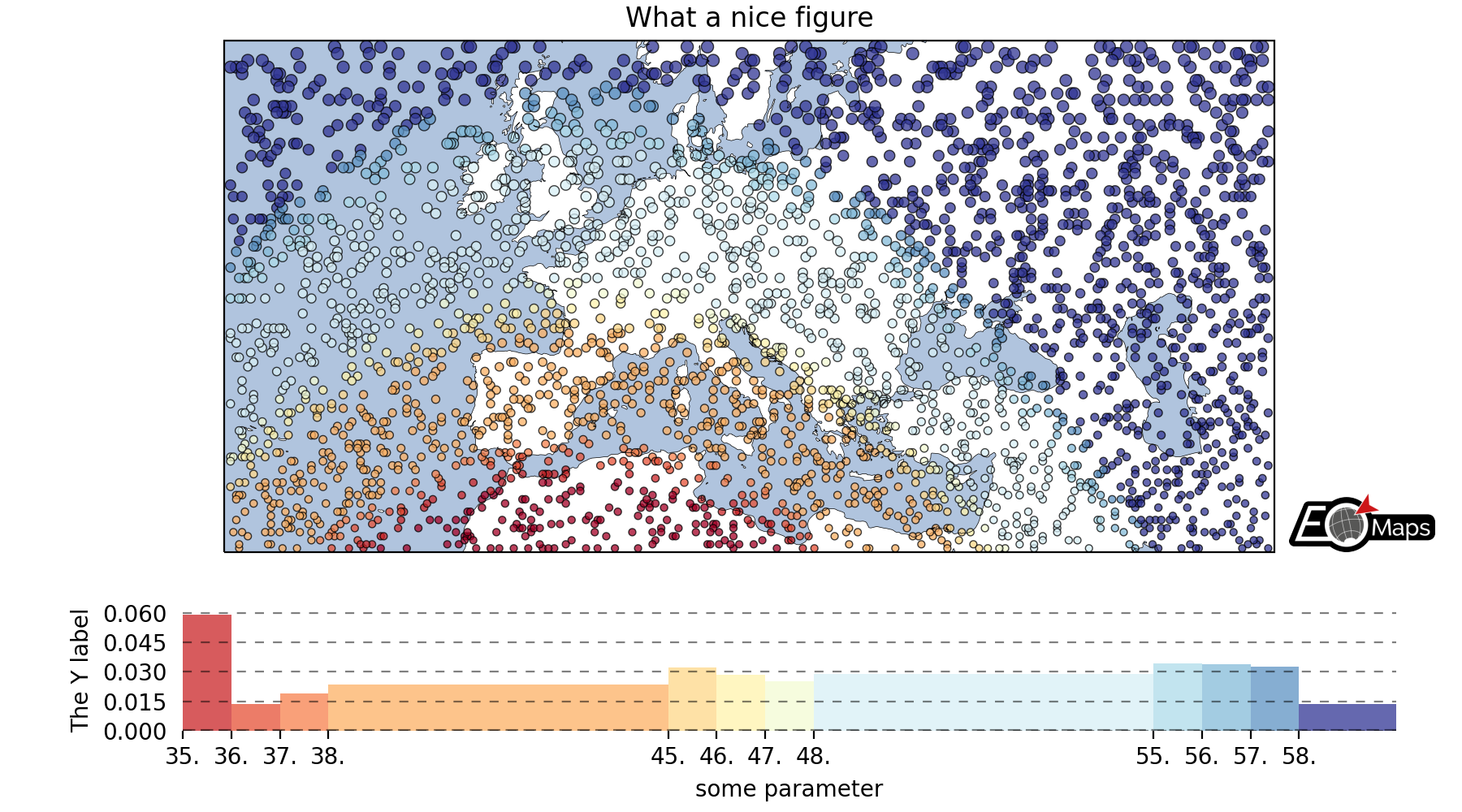
🗺 Customize the appearance of the plot
use
m.set_plot_specs()to set the general appearance of the plotafter creating the plot, you can access individual objects via
m.figure.<...>… most importantly:f: the matplotlib figureax,ax_cb,ax_cb_plot: the axes used for plotting the map, colorbar and histogramgridspec,cb_gridspec: the matplotlib GridSpec instances for the plot and the colorbarcoll: the collection representing the data on the map
# EOmaps example 3: Customize the appearance of the plot

from eomaps import Maps
import pandas as pd
import numpy as np

# ----------- create some example-data
lon, lat = np.meshgrid(np.arange(-30, 60, 0.25), np.arange(30, 60, 0.3))
data = pd.DataFrame(
    dict(lon=lon.flat, lat=lat.flat, data_variable=np.sqrt(lon**2 + lat**2).flat)
)
data = data.sample(3000)  # take 3000 random datapoints from the dataset
# ------------------------------------

m = Maps(
    crs=3857, figsize=(9, 5)
)  # create a map in a pseudo-mercator (epsg 3857) projection
m.add_feature.preset.ocean(fc="lightsteelblue")
m.add_feature.preset.coastline(lw=0.25)
m.set_data(
    data=data,  #
    x="lon",
    y="lat",
    in_crs=4326,
    cpos="c",  # pixel-coordinates represent "center-position" (default)
    cpos_radius=None,  # radius to shift the center-position if "cpos" is not "c"
)

m.ax.set_title("What a nice figure")
m.set_shape.geod_circles(radius=30000)  # plot geodesic-circles with 30 km radius

# set the classification scheme that should be applied to the data
m.set_classify_specs(
    scheme="UserDefined", bins=[35, 36, 37, 38, 45, 46, 47, 48, 55, 56, 57, 58]
)

m.plot_map(
    edgecolor="k",  # give shapes a black edgecolor
    linewidth=0.5,  # ... with a linewidth of 0.5
    cmap="RdYlBu",  # use a red-yellow-blue colormap
    vmin=35,  # map colors to values above 35
    vmax=60,  # map colors to values below 60
    alpha=0.75,  # add some transparency
)  # pass some additional arguments to the plotted collection

# ------------------ add a colorbar and change it's appearance
m.add_colorbar(
    label="some parameter",
    hist_bins="bins",
    hist_size=1,
    hist_kwargs=dict(density=True),
)

# add a y-label to the histogram
_ = m.colorbar.ax_cb_plot.set_ylabel("The Y label")

# adjust the padding of the subplots
m.subplots_adjust(bottom=0.1, top=0.95, left=0.1, right=0.95, hspace=0.2)
# manually re-position the colorbar
# m.colorbar.ax.set_position([0.125, 0.1, 0.83, 0.15])

# add a logo to the plot
m.add_logo(position="lr", pad=(-1.1, 0), size=0.1)

m.apply_layout(
    {
        "0_map": [0.13798, 0.27054, 0.76154, 0.66818],
        "1_cb": [0.2325, 0.09, 0.6, 0.135],
        "1_cb_histogram_size": 1,
        "2_logo": [0.875, 0.09, 0.1, 0.07425],
    }
)
🛸 Turn your maps into powerful widgets
Callback functions can easily be attached to the plot to turn it into an interactive plot-widget!
- there’s a nice list of (customizeable) pre-defined callbacks accessible via:
m.cb.click,m.cb.pick,m.cb.keypressandm.cb.dynamicuse
annotate(andclear_annotations) to create text-annotationsuse
mark(andclear_markers) to add markersuse
peek_layer(andswitch_layer) to compare multiple layers of data… and many more:
plot,print_to_console,get_values,load…
- … but you can also define a custom one and connect it via
m.cb.click.attach(<my custom function>)(works also withpickandkeypress)!
# EOmaps example 4: Turn your maps into a powerful widgets
# %matplotlib widget
from eomaps import Maps
import pandas as pd
import numpy as np

# create some data
# lon, lat = np.mgrid[-20:40, 30:60]
lon, lat = np.meshgrid(np.linspace(-20, 40, 50), np.linspace(30, 60, 50))

data = pd.DataFrame(
    dict(lon=lon.flat, lat=lat.flat, data=np.sqrt(lon**2 + lat**2).flat)
)

# --------- initialize a Maps object and plot a basic map
m = Maps(crs=3035, figsize=(10, 8))
m.set_data(data=data, x="lon", y="lat", in_crs=4326)
m.ax.set_title("A clickable widget!")
m.set_shape.rectangles()
# double the estimated radius in x-direction to make the plot dense
m.shape.radius = (m.shape.radius[0] * 2, m.shape.radius[1])

m.set_classify_specs(scheme="EqualInterval", k=5)
m.add_feature.preset.coastline()
m.add_feature.preset.ocean()
m.plot_map()

# --------- attach pre-defined CALLBACK functions ---------

### add a temporary annotation and a marker if you left-click on a pixel
m.cb.pick.attach.mark(
    button=1,
    permanent=False,
    fc=[0, 0, 0, 0.5],
    ec="w",
    ls="--",
    buffer=2.5,
    shape="ellipses",
    zorder=1,
)
m.cb.pick.attach.annotate(
    button=1,
    permanent=False,
    bbox=dict(boxstyle="round", fc="w", alpha=0.75),
    zorder=10,
)
### save all picked values to a dict accessible via m.cb.get.picked_vals
cid = m.cb.pick.attach.get_values(button=1)

### add a permanent marker if you right-click on a pixel
m.cb.pick.attach.mark(
    button=3,
    permanent=True,
    facecolor=[1, 0, 0, 0.5],
    edgecolor="k",
    buffer=1,
    shape="rectangles",
    zorder=1,
)

### add a customized permanent annotation if you right-click on a pixel
def text(m, ID, val, pos, ind):
    return f"ID={ID}"


cid = m.cb.pick.attach.annotate(
    button=3,
    permanent=True,
    bbox=dict(boxstyle="round", fc="r"),
    text=text,
    xytext=(10, 10),
    zorder=2,  # use zorder=2 to put the annotations on top of the markers
)

### remove all permanent markers and annotations if you middle-click anywhere on the map
cid = m.cb.pick.attach.clear_annotations(button=2)
cid = m.cb.pick.attach.clear_markers(button=2)

# --------- define a custom callback to update some text to the map
# (use a high zorder to draw the texts above all other things)
txt = m.ax.text(
    0.5,
    0.35,
    "You clicked on 0 pixels so far",
    fontsize=15,
    horizontalalignment="center",
    verticalalignment="top",
    color="w",
    fontweight="bold",
    animated=True,
    zorder=99,
    transform=m.ax.transAxes,
)
txt2 = m.ax.text(
    0.18,
    0.9,
    "   lon    /    lat " + "\n",
    fontsize=12,
    horizontalalignment="right",
    verticalalignment="top",
    fontweight="bold",
    animated=True,
    zorder=99,
    transform=m.ax.transAxes,
)

# add the custom text objects to the blit-manager (m.BM) to avoid re-drawing the whole
# image if the text changes.
m.BM.add_artist(txt)
m.BM.add_artist(txt2)


def cb1(m, pos, ID, val, **kwargs):
    # update the text that indicates how many pixels we've clicked
    nvals = len(m.cb.pick.get.picked_vals["ID"])
    txt.set_text(
        f"You clicked on {nvals} pixel"
        + ("s" if nvals > 1 else "")
        + "!\n... and the "
        + ("average " if nvals > 1 else "")
        + f"value is {np.mean(m.cb.pick.get.picked_vals['val']):.3f}"
    )

    # update the list of lon/lat coordinates on the top left of the figure
    d = m.data.loc[ID]
    lonlat_list = txt2.get_text().splitlines()
    if len(lonlat_list) > 10:
        lonlat_txt = lonlat_list[0] + "\n" + "\n".join(lonlat_list[-10:]) + "\n"
    else:
        lonlat_txt = txt2.get_text()
    txt2.set_text(lonlat_txt + f"{d['lon']:.2f}  /  {d['lat']:.2f}" + "\n")


cid = m.cb.pick.attach(cb1, button=1, m=m)


def cb2(m, pos, ID, val, **kwargs):
    # plot a marker at the pixel-position
    (l,) = m.ax.plot(*pos, marker="*", animated=True)
    # print the value at the pixel-position
    # use a low zorder so the text will be drawn below the temporary annotations
    t = m.ax.text(
        pos[0],
        pos[1] - 150000,
        f"{val:.2f}",
        horizontalalignment="center",
        verticalalignment="bottom",
        color=l.get_color(),
        animated=True,
        zorder=1,
    )
    # add the artists to the Blit-Manager (m.BM) to avoid triggering a re-draw of the
    # whole figure each time the callback triggers

    m.BM.add_artist(l)
    m.BM.add_artist(t)


cid = m.cb.pick.attach(cb2, button=3, m=m)

# add some static text
infotext = (
    "Left-click: temporary annotations\n"
    + "Right-click: permanent annotations\n"
    + "Middle-click: clear permanent annotations"
)

_ = m.f.text(
    0.66,
    0.92,
    infotext,
    fontsize=10,
    horizontalalignment="left",
    verticalalignment="top",
    color="k",
    fontweight="bold",
    bbox=dict(facecolor="w", alpha=0.75),
)

# add a basic "target-indicator" on mouse-movement
m.cb.move.attach.mark(
    fc="r", ec="none", radius=10000, shape="geod_circles", permanent=False
)
m.cb.move.attach.mark(
    fc="none", ec="r", radius=50000, shape="geod_circles", permanent=False
)


m.add_colorbar(hist_bins="bins")
m.add_logo()
🌲 🏡🌳 Add overlays and indicators
(… plot-generation might take a bit longer since overlays need to be downloaded first!)
add basic overlays with m.add_overlay
add static annotations / markers with m.add_annotation and m.add_marker
use “connected” Maps-objects to get multiple interactive data-layers!
# EOmaps example 5: Add overlays and indicators

from eomaps import Maps
import pandas as pd
import numpy as np
import matplotlib.pyplot as plt
from matplotlib.patches import Patch

# create some data
lon, lat = np.meshgrid(np.linspace(-20, 40, 100), np.linspace(30, 60, 100))
data = pd.DataFrame(
    dict(
        lon=lon.flat,
        lat=lat.flat,
        param=(((lon - lon.mean()) ** 2 - (lat - lat.mean()) ** 2)).flat,
    )
)
data_OK = data[data.param >= 0]
data_OK.var = np.sqrt(data_OK.param)
data_mask = data[data.param < 0]

# --------- initialize a Maps object and plot a basic map
m = Maps(Maps.CRS.Orthographic(), figsize=(10, 7))
m.ax.set_title("Wooohoo, a flashy map-widget with static indicators!")
m.set_data(data=data_OK, x="lon", y="lat", in_crs=4326)
m.set_shape.rectangles(mesh=True)
m.set_classify_specs(scheme="Quantiles", k=10)
# double the estimated radius in x-direction to make the plot dense
m.shape.radius = (m.shape.radius[0] * 2, m.shape.radius[1])

m.plot_map(cmap="Spectral_r")

# ... add a basic "annotate" callback
cid = m.cb.click.attach.annotate(bbox=dict(alpha=0.75), color="w")

# --------- add another layer of data to indicate the values in the masked area
#           (copy all defined specs but the classification)
m2 = m.new_layer(copy_classify_specs=False)
m2.data_specs.data = data_mask
m2.set_shape.rectangles(mesh=False)
# double the estimated radius in x-direction to make the plot dense
m2.shape.radius = (m2.shape.radius[0] * 2, m2.shape.radius[1])
m2.plot_map(cmap="magma")
# --------- add another layer with data that is dynamically updated if we click on the masked area
m3 = m.new_layer(copy_classify_specs=False)
m3.data_specs.data = data_OK.sample(1000)
m3.set_shape.ellipses(radius=25000, radius_crs=3857)

# plot the map and set dynamic=True to allow continuous updates of the collection
m3.plot_map(cmap="gist_ncar", edgecolor="w", linewidth=0.25, dynamic=True)

# --------- define a callback that will change the values of the previously plotted dataset
#           NOTE: this is not possible for the shapes:  "shade_points" and "shade_raster" !
def callback(m, **kwargs):
    selection = np.random.randint(0, len(m.data), 1000)
    m.coll.set_array(data_OK.param.iloc[selection])


# attach the callback (to update the dataset plotted on the Maps object "m3")
m.cb.click.attach(callback, m=m3)

# --------- add some basic overlays from NaturalEarth

# clip the features by the current map extent and use geopandas for reprojections
# since it works for the selected map-extent and it is usually faster than cartopy
# args = dict(reproject="gpd", clip="extent")

m.add_feature.preset.coastline()
m.add_feature.preset.lakes()
m.add_feature.preset.rivers_lake_centerlines()
m.add_feature.preset.countries()
m.add_feature.preset.urban_areas()

# add a customized legend
leg = m.ax.legend(
    [
        Patch(fc="b"),
        plt.Line2D([], [], c="b"),
        Patch(fc="r"),
        plt.Line2D([], [], c=".75"),
    ],
    ["lakes", "rivers", "urban areas", "countries"],
    ncol=2,
    loc="lower center",
    facecolor="w",
    framealpha=1,
)
# add the legend to the blit-manager to keep it on top of dynamically updated artists
leg.zorder = 999
m.BM.add_artist(leg)

# --------- add some fancy (static) indicators for selected pixels
mark_id = 6060
for buffer in np.linspace(1, 5, 10):
    m.add_marker(
        ID=mark_id,
        shape="ellipses",
        radius="pixel",
        fc=(1, 0, 0, 0.1),
        ec="r",
        buffer=buffer * 5,
        n=100,  # use 100 points to represet the ellipses
    )
m.add_marker(
    ID=mark_id, shape="rectangles", radius="pixel", fc="g", ec="y", buffer=3, alpha=0.5
)
m.add_marker(
    ID=mark_id, shape="ellipses", radius="pixel", fc="k", ec="none", buffer=0.2
)
m.add_annotation(
    ID=mark_id,
    text=f"Here's Vienna!\n... the data-value is={m.data.param.loc[mark_id]:.2f}",
    xytext=(80, 85),
    textcoords="offset points",
    bbox=dict(boxstyle="round", fc="w", ec="r"),
    horizontalalignment="center",
    arrowprops=dict(arrowstyle="fancy", facecolor="r", connectionstyle="arc3,rad=0.35"),
)

mark_id = 3324
m.add_marker(ID=mark_id, shape="ellipses", radius=3, fc="none", ec="g", ls="--", lw=2)
m.add_annotation(
    ID=mark_id,
    text="",
    xytext=(0, 98),
    textcoords="offset points",
    arrowprops=dict(
        arrowstyle="fancy", facecolor="g", connectionstyle="arc3,rad=-0.25"
    ),
)

m.add_marker(
    ID=mark_id,
    shape="geod_circles",
    radius=500000,
    radius_crs=3857,
    fc="none",
    ec="b",
    ls="--",
    lw=2,
)

m.add_annotation(
    ID=mark_id,
    text=(
        "Here's the center of:\n"
        + "    $\\bullet$ a blue 'circle' with 50km radius\n"
        + "    $\\bullet$ a green 'circle' with 3deg radius"
    ),
    xytext=(-80, 100),
    textcoords="offset points",
    bbox=dict(boxstyle="round", fc="w", ec="k"),
    horizontalalignment="left",
    arrowprops=dict(arrowstyle="fancy", facecolor="w", connectionstyle="arc3,rad=0.35"),
)

cb = m.add_colorbar(label="The Data", tick_precision=1)
m.add_logo()
- The data displayed in the above gif is taken from:
NaturalEarth (https://www.naturalearthdata.com/)
🛰 WebMap services and layer-switching
add WebMap services using
m.add_wmsandm.add_wmtscompare different data-layers and WebMap services using
m.cb.click.peek_layerandm.cb.keypress.switch_layer
# EOmaps example 6: WebMap services and layer-switching

# %matplotlib widget
from eomaps import Maps
import numpy as np
import pandas as pd

# create some data
lon, lat = np.meshgrid(np.linspace(-50, 50, 150), np.linspace(30, 60, 150))
data = pd.DataFrame(
    dict(lon=lon.flat, lat=lat.flat, data=np.sqrt(lon**2 + lat**2).flat)
)
# --------------------------------

m = Maps(Maps.CRS.GOOGLE_MERCATOR, layer="S1GBM_vv")
# set the crs to GOOGLE_MERCATOR to avoid reprojecting the WebMap data
# (makes it a lot faster and it will also look much nicer!)
# ------------- LAYER 0
# add a layer showing S1GBM
m.add_wms.S1GBM.add_layer.vv()

# ------------- LAYER 1
# if you just want to add features, you can also do it within the same Maps-object!
# add OpenStreetMap on the currently invisible layer (OSM)
m.add_wms.OpenStreetMap.add_layer.default(layer="OSM")

# ------------- LAYER 2
# create a new layer and plot some data
m2 = m.new_layer(layer="data")
m2.set_data(data=data.sample(5000), x="lon", y="lat", crs=4326)
m2.set_shape.geod_circles(radius=20000)
m2.plot_map()

# add a callback that is only executed if the "data" layer is visible
m2.cb.pick.attach.annotate(zorder=100)  # use a high zorder to put it on top

# ------------ CALLBACKS
# since m.layer == "all", the callbacks assigned to "m" will be executed on all layers!

# on a left-click, show layers ("data", "OSM") in a rectangle
# (with a size of 20% of the axis)
m.all.cb.click.attach.peek_layer(layer="data|OSM", how=0.2)

# on a right-click, "swipe" the layers ("data", "S1GBM_vv") from the left
m.all.cb.click.attach.peek_layer(
    layer="data|S1GBM_vv",
    how="left",
    button=3,
)

# switch between the layers with the keys 0, 1 and 2
m.all.cb.keypress.attach.switch_layer(layer="S1GBM_vv", key="0")
m.all.cb.keypress.attach.switch_layer(layer="OSM", key="1")
m.all.cb.keypress.attach.switch_layer(layer="data", key="2")

# ------------------------------
m.f.set_size_inches(9, 4)
m.subplots_adjust(left=0.01, right=0.99, bottom=0.01, top=0.99)

m.add_logo()

# add a utility-widget for switching the layers
m.util.layer_selector(
    loc="upper left",
    ncol=3,
    bbox_to_anchor=(0.01, 0.99),
    layers=["OSM", "S1GBM_vv", "data"],
)

m.util.layer_slider(
    pos=(0.5, 0.93, 0.38, 0.025),
    color="r",
    handle_style=dict(facecolor="r"),
    txt_patch_props=dict(fc="w", ec="none", alpha=0.75, boxstyle="round, pad=.25"),
    layers=["OSM", "S1GBM_vv", "data"],
)

# show the S1GBM layer on start
m.show_layer("S1GBM_vv")
- The data displayed in the above gif is taken from:
Sentinel-1 Global Backscatter Model (https://researchdata.tuwien.ac.at/records/n2d1v-gqb91)
OpenStreetMap hosted by Mundialis (https://www.mundialis.de/en/ows-mundialis/)
🚀 Using geopandas - interactive shapes!
- geopandas.GeoDataFrames can be used to assign callbacks with EOmaps.
- to make a GeoDataFrame pickable, first use
m.add_gdf(picker_name="MyPicker") now you can assign callbacks via
m.cb.MyPicker.attach...just as you would do with the ordinarym.cb.clickorm.cb.pickcallbacks
- to make a GeoDataFrame pickable, first use
Note
For large datasets that are visualized as simple rectangles, ellipses etc.
it is recommended to use EOmaps to visualize the data with m.plot_map()
since the generation of the plot and the identification of the picked pixels
will be much faster!
If the GeoDataFrame contains multiple different geometry types (e.g. Lines, Patches, etc.) a unique pick-collection will be assigned for each of the geometry types!
# EOmaps example 7: Using geopandas - interactive shapes!

from eomaps import Maps, MapsGrid
import pandas as pd
import numpy as np
import geopandas as gpd

# geopandas is used internally... the import is just here to show that!


# ----------- create some example-data
lon, lat = np.meshgrid(np.linspace(-180, 180, 25), np.linspace(-90, 90, 25))
data = pd.DataFrame(
    dict(lon=lon.flat, lat=lat.flat, data=np.sqrt(lon**2 + lat**2).flat)
)

# ----------- setup some maps objects and assign datasets and the plot-crs
mg = MapsGrid(1, 2, crs=[4326, Maps.CRS.Orthographic(45, 45)], figsize=(10, 5))
mg.m_0_0.set_data(data=data.sample(100), x="lon", y="lat", crs=4326, parameter="data")

mg.m_0_1.set_data(data=data, x="lon", y="lat", crs=4326)

mg.add_feature.preset.ocean()

# fetch the data (incl. metadata) for the "admin_0_countries" feature
countries = mg.add_feature.cultural.admin_0_countries.get_gdf(scale=50)
mg.add_gdf(
    countries,
    picker_name="countries",
    pick_method="contains",
    val_key="NAME",
    fc="none",
    ec="k",
    lw=0.5,
)

mg.set_shape.rectangles(radius=3, radius_crs=4326)
mg.plot_map(alpha=0.75, ec=(1, 1, 1, 0.5))

for m in mg:
    # attach a callback to highlite the rectangles
    m.cb.pick.attach.mark(
        permanent=False, shape="rectangles", fc="none", ec="b", lw=2, zorder=5
    )

    # attach a callback to highlite the countries and indicate the names
    m.cb.pick["countries"].attach.highlight_geometry(fc="r", ec="k", lw=0.5)
    m.cb.pick["countries"].attach.annotate(text=lambda val, **kwargs: str(val))


mg.share_pick_events()  # share default pick events
mg.share_pick_events("countries")  # share the events of the "countries" picker
mg.m_0_1.add_logo()
- The data displayed in the above gif is taken from:
NaturalEarth (https://www.naturalearthdata.com/)
📏 Adding scalebars - what about distances?
- EOmaps has a nice customizable scalebar feature!
use
s = m.add_scalebar(lon, lat, azim)to attach a scalebar to the plotonce the scalebar is there, you can drag it around and change its properties via
s.set_position,s.set_scale_props(),s.set_label_props()ands.set_patch_props()
Note
You can also simply drag the scalebar with the mouse!
LEFT-click on it to make it interactive!
RIGHT-click anywhere on the map to make it fixed again
There are also some useful keyboard shortcuts you can use while the scalebar is interactive
use
+/-to rotate the scalebaruse
alt++/-to set the text-offsetuse the
arrow-keysto increase the frame-widthsuse
alt+arrow-keysto decrease the frame-widthsuse
deleteto remove the scalebar from the plot
# EOmaps example 8: Adding scalebars - what about distances?

from eomaps import Maps
import matplotlib.pyplot as plt

plt.get_backend()

m = Maps(figsize=(9, 5))
m.add_feature.preset.ocean(ec="k", scale="110m")

s1 = m.add_scalebar(
    -11,
    -50,
    -45,
    scale=500000,
    scale_props=dict(n=10, width=5, colors=("k", ".25", ".5", ".75", ".95")),
    patch_props=dict(offsets=(1, 1.4, 1, 1), fc=(0.7, 0.8, 0.3, 1)),
    label_props=dict(offset=0.5, scale=1.4, every=5, weight="bold", family="Calibri"),
)

s2 = m.add_scalebar(
    50,
    -20,
    45,
    scale_props=dict(n=6, width=3, colors=("k", "r")),
    patch_props=dict(fc="none", ec="none", offsets=(1, 1, 1, 2)),
    label_props=dict(scale=1, rotation=45, weight="bold", family="Impact", offset=0.5),
)

s3 = m.add_scalebar(
    -73,
    8,
    0,
    scale=500000,
    scale_props=dict(n=6, width=3, colors=("w", "r")),
    patch_props=dict(fc=".25", ec="k", lw=0.5, offsets=(1, 1, 1, 2)),
    label_props=dict(color="w", rotation=45, weight="bold", family="Impact"),
)

# it's also possible to update the properties of an existing scalebar
# via the setter-functions!
s4 = m.add_scalebar()
s4.set_position(-140, -55, 0)
s4.set_scale_props(scale=750000, n=10, width=4, colors=("k", "w"))
s4.set_patch_props(fc="none", ec="none", offsets=(1, 1.6, 1, 1))
s4.set_label_props(scale=1.5, offset=0.5, every=2, weight="bold", family="Courier New")

# NOTE that the black-and-white scalebar is automatically re-scaled and re-positioned
#      on zoom events (the default if you don't provide an explicit scale & position)!
#      ... to manually override this behaviour, uncomment the following lines

# s4._auto_position = None
# s4._autoscale = None


m.add_logo()
- The data displayed in the above gif is taken from:
NaturalEarth (https://www.naturalearthdata.com/)
🌌 Data analysis widgets - Interacting with a database
Callback-functions can be used to trigger updates on other plots. This example shows how to use EOmaps to analyze a database that is associated with a map.
create a grid of
Mapsobjects and ordinary matplotlib axes viaMapsGriddefine a custom callback to update the plots if you click on the map
# EOmaps example 9:  Data analysis widgets - Interacting with a database

from eomaps import MapsGrid, Maps
import pandas as pd
import numpy as np


# just a helper-function to calculate axis-limits with a margin
def get_limits(data, margin=0.05):
    mi, ma = np.nanmin(data), np.nanmax(data)
    dm = margin * (ma - mi)
    return mi - dm, ma + dm


# ============== create a random database =============
length, Nlon, Nlat = 1000, 100, 50
lonmin, lonmax, latmin, latmax = -70, 175, 0, 75

database = np.full((Nlon * Nlat, length), np.nan)
for i in range(Nlon * Nlat):
    size = np.random.randint(1, length)
    x = np.random.normal(loc=np.random.rand(), scale=np.random.rand(), size=size)
    np.put(database, range(i * length, i * length + size), x)
lon, lat = np.meshgrid(
    np.linspace(lonmin, lonmax, Nlon), np.linspace(latmin, latmax, Nlat)
)

IDs = [f"point_{i}" for i in range(Nlon * Nlat)]
database = pd.DataFrame(database, index=IDs)
coords = pd.DataFrame(dict(lon=lon.flat, lat=lat.flat), index=IDs)

# -------- calculate the number of values in each dataset
#          (e.g. the data actually shown on the map)
data = pd.DataFrame(dict(count=database.count(axis=1), **coords))
# =====================================================


# -------- initialize a MapsGrid with a map on top and 2 ordinary axes below
mg = MapsGrid(
    2,
    2,
    m_inits=dict(top=(0, slice(0, 2))),
    ax_inits=dict(left=(1, 0), right=(1, 1)),
    height_ratios=(3, 2),
)

mg.add_feature.preset.ocean()
mg.add_feature.preset.coastline()

# -------- set the specs for the Maps-object of the grid and plot the map
mg.m_top.set_data(data=data, x="lon", y="lat", crs=4326)
mg.m_top.set_classify_specs(
    scheme=Maps.CLASSIFIERS.UserDefined, bins=[50, 100, 200, 400, 800]
)
mg.m_top.set_shape.ellipses(radius=0.5)
mg.m_top.plot_map()

# -------- set some axis labels
mg.ax_left.set_ylabel("data-values")
mg.ax_left.set_xlabel("data-index")
mg.ax_right.set_ylabel("data-values")
mg.ax_right.set_xlabel("histogram count")

# -------- add the axes to the blit-manager so that their artists
#          as well as axis limits etc. are dynamically updated
mg.parent.BM.add_artist(mg.ax_left)
mg.parent.BM.add_artist(mg.ax_right)

# -------- define a custom callback function to update the plots
def update_plots(ID, **kwargs):
    # get the data
    x = database.loc[ID].dropna()

    # plot the lines and histograms
    (l,) = mg.ax_left.plot(x, lw=0.5, marker=".", c="C0")
    cnt, val, art = mg.ax_right.hist(
        x.values, bins=50, orientation="horizontal", fc="C0"
    )
    # add all artists as "temporary artists" so that they are removed
    # when the next datapoint is selected
    for a in [l, *art]:
        mg.m_top.cb.pick.add_temporary_artist(a)

    # manually set the axis limits (autoscaling not always works as expected)
    mg.ax_left.set_ylim(*get_limits(x))
    mg.ax_left.set_xlim(*get_limits(x.index))
    mg.ax_right.set_ylim(*get_limits(x))
    mg.ax_right.set_xlim(*get_limits(cnt))


# attach the custom callback (and some pre-defined)
mg.m_top.cb.pick.attach(update_plots)
mg.m_top.cb.pick.attach.annotate()
mg.m_top.cb.pick.attach.mark(permanent=False, buffer=1, fc="none", ec="r")
mg.m_top.cb.pick.attach.mark(permanent=False, buffer=2, fc="none", ec="r", ls=":")


# add a colorbar
mg.m_top.add_colorbar(0.25, label="Number of observations")
mg.m_top.colorbar.ax_cb_plot.tick_params(labelsize=6)

# update the padding for the axes
mg.subplots_adjust(bottom=0.1, left=0.12, right=0.94, wspace=0.3, hspace=0.3)

mg.add_logo(fix_position=True)
🧮 Select 1D slices of a 2D dataset
Use custom callback functions to perform arbitrary tasks on the data when clicking on the map.
Identify clicked row/col in a 2D dataset
Highlight the found row and column using a new layer
(requires EOmaps >= v3.1.4)
# %matplotlib widget
from eomaps import Maps, MapsGrid
import numpy as np
import itertools

# setup some random 2D data
lon, lat = np.meshgrid(np.linspace(-180, 180, 200), np.linspace(-90, 90, 100))
data = np.sqrt(lon**2 + lat**2) + np.random.normal(size=lat.shape) ** 2 * 20

name = "some parameter"
# -------------------------

# initialize a map and 2 ordinary plots that will be used to visualize the data
mg = MapsGrid(
    2,
    2,
    m_inits={"map": (slice(0, 2), 0)},
    ax_inits={"row": (0, 1), "col": (1, 1)},
    crs=Maps.CRS.InterruptedGoodeHomolosine(),
    figsize=(8, 5),
)

mg.gridspec.update(top=0.95, bottom=0.1, left=0.01, right=0.99, hspace=0.3, wspace=0.15)

# set the limits and labels for the axes
mg.ax_row.set_xlabel("Longitude")
mg.ax_row.set_ylabel(name)
mg.ax_row.set_xlim(-185, 185)
mg.ax_row.set_ylim(data.min(), data.max())

mg.ax_col.set_xlabel("Latitude")
mg.ax_col.set_ylabel(name)
mg.ax_col.set_xlim(-92.5, 92.5)
mg.ax_col.set_ylim(data.min(), data.max())

# ---- plot the map
m = mg.m_map  # get the Maps-object

m.set_data(data, lon, lat, parameter=name)
m.set_classify_specs(Maps.CLASSIFIERS.NaturalBreaks, k=5)
m.plot_map()
m.add_colorbar()
m.colorbar.ax_cb.tick_params(rotation=90)
m.add_feature.preset.coastline()

# add some new layers that will be used to indicate rows and columns
m2 = m.new_layer()
m3 = m.new_layer()

# ---- define a custom callback to indicate the clicked row/column
def cb(m, ind, ID, coords, *args, **kwargs):

    # get row and column from the data
    # NOTE: "ind" always represents the index of the flattened array!
    r, c = next(itertools.islice(np.ndindex(m.data.shape), ind, None))
    # update the coordinates in our dictionary
    coords.update(dict(r=r, c=c))

    # ---- highlight the picked column
    m2.set_data(m.data_specs.data[:, c], m.data_specs.x[:, c], m.data_specs.y[:, c])
    m2.set_shape.ellipses(m.shape.radius)
    # use "dynamic=True" to avoid re-drawing the background all the time
    # use "set_extent=False" to avoid resetting the plot extent on each draw
    m2.plot_map(fc="none", ec="b", set_extent=False, dynamic=True)
    m.cb.pick.add_temporary_artist(m2.coll)  # remove the highlight on next pick

    # ---- highlight the picked row
    m3.set_data(m.data_specs.data[r, :], m.data_specs.x[r, :], m.data_specs.y[r, :])
    m3.set_shape.ellipses(m.shape.radius)
    m3.plot_map(fc="none", ec="r", set_extent=False, dynamic=True)
    m.cb.pick.add_temporary_artist(m3.coll)  # remove the highlight on next pick

    # ---- plot the data for the selected column
    (art0,) = mg.ax_col.plot(m.data_specs.y[:, c], m.data_specs.data[:, c], c="b")
    (art01,) = mg.ax_col.plot(
        m.data_specs.y[r, c],
        m.data_specs.data[r, c],
        c="k",
        marker="o",
        markerfacecolor="none",
        ms=10,
    )

    m.cb.pick.add_temporary_artist(art0)
    m.cb.pick.add_temporary_artist(art01)

    # ---- plot the data for the selected row
    (art1,) = mg.ax_row.plot(m.data_specs.x[r, :], m.data_specs.data[r, :], c="r")
    (art11,) = mg.ax_row.plot(
        m.data_specs.x[r, c],
        m.data_specs.data[r, c],
        c="k",
        marker="o",
        markerfacecolor="none",
        ms=10,
    )
    m.cb.pick.add_temporary_artist(art1)
    m.cb.pick.add_temporary_artist(art11)

    # ---- add a temporary pick-annotation
    # NOTE: *args, **kwargs must be forwarded to the additional callback!
    m.cb.pick._cb.annotate(
        ID=ID,
        text=(
            f"row/col={r}/{c}\n"
            + f"lon/lat={m.data_specs.x[r,c]:.2f}/{m.data_specs.y[r,c]:.2f}"
            + f"\nval={m.data[r,c]:.2f}"
        ),
        permanent=False,
        *args,
        **kwargs,
    )


# initialize a dict that can be used to access the last clicked (row, col)
coords = dict(r=None, c=None)
# attach the custom callback
m.cb.pick.attach(cb, coords=coords, m=m)
🔬 Inset-maps - get a zoomed-in view on selected areas
Quickly create nice inset-maps to show details for specific regions.
the location and extent of the inset can be defined in any given crs
(or as a geodesic circle with a radius defined in meters)
the inset-map can have a different crs than the “parent” map
(requires EOmaps >= v4.1)
from eomaps import Maps

m = Maps(Maps.CRS.Orthographic())
m.add_feature.preset.coastline(lw=0.25)  # add some coastlines

# ---------- create a new inset-map
#            showing a 15 degree rectangle around the xy-point
m2 = m.new_inset_map(
    xy=(5, 45),
    xy_crs=4326,
    shape="rectangles",
    radius=15,
    plot_position=(0.75, 0.4),
    plot_size=0.5,
    inset_crs=4326,
    boundary=dict(ec="r", lw=1),
    indicate_extent=dict(fc=(1, 0, 0, 0.25)),
)

# populate the inset with some more detailed features
m2.add_feature.preset.coastline()
m2.add_feature.preset.ocean()
m2.add_feature.preset.land()
m2.add_feature.preset.countries()
m2.add_feature.preset.urban_areas()


# ---------- create another inset-map
#            showing a 400km circle around the xy-point
m3 = m.new_inset_map(
    xy=(5, 45),
    xy_crs=4326,
    shape="geod_circles",
    radius=400000,
    plot_position=(0.25, 0.4),
    plot_size=0.5,
    inset_crs=3035,
    boundary=dict(ec="g", lw=2),
    indicate_extent=dict(fc=(0, 1, 0, 0.25)),
)

# populate the inset with some features
m3.add_wms.OpenStreetMap.add_layer.stamen_terrain_background()

# print some data on all of the maps
m3.set_shape.ellipses(n=100)  # use a higher ellipse-resolution on the inset-map
for m_i in [m, m2, m3]:
    m_i.set_data([1, 2, 3, 1], [5, 6, 7, 6.6], [45, 46, 47, 48.5], crs=4326)
    m_i.plot_map(alpha=0.75, ec="k", lw=0.5, set_extent=False)

# add an annotation for the second datapoint to the inset-map
m3.add_annotation(ID=1, xytext=(-120, 80))

# indicate the extent of the second inset on the first inset
m3.indicate_inset_extent(m2, ec="g")

# add some additional text to the inset-maps
for m_i, txt, color in zip([m2, m3], ["epsg: 4326", "epsg: 3035"], ["r", "g"]):
    txt = m_i.ax.text(
        0.5,
        0,
        txt,
        transform=m_i.ax.transAxes,
        horizontalalignment="center",
        bbox=dict(facecolor=color),
    )
    # add the text-objects as artists to the blit-manager
    m_i.BM.add_artist(txt)

m3.add_colorbar(hist_bins=20, margin=dict(bottom=-0.2), label="some parameter")
# move the inset map (and the colorbar) to a different location
m3.set_inset_position(x=0.3)
# set the y-ticks of the colorbar histogram
m3.colorbar.ax_cb_plot.set_yticks([0, 1, 2])
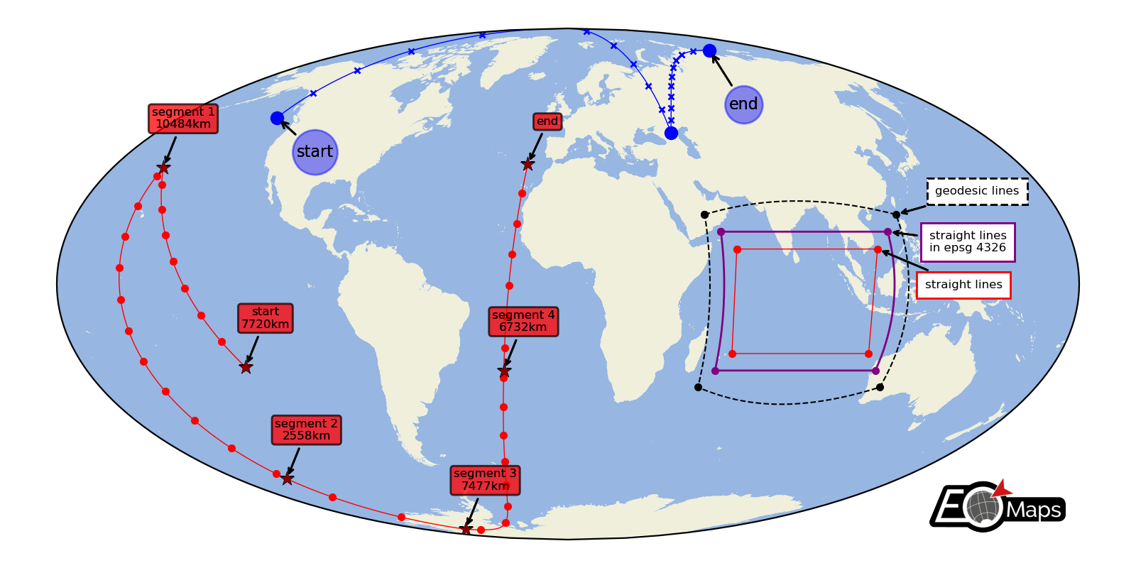
🚲 Lines and Annotations
Draw lines defined by a set of anchor-points and add some nice annotations.
Connect the anchor-points via:
geodesic lines
straight lines
reprojected straight lines defined in a given projection
(requires EOmaps >= v4.3.1)
# EOmaps example : drawing lines on a map

from eomaps import Maps

m = Maps(Maps.CRS.Mollweide(), figsize=(8, 4))
m.add_feature.preset.ocean()
m.add_feature.preset.land()

# get a few points for some basic lines
l1 = [(-135, 50), (45, 45), (123, 76)]
l2 = [(-120, -24), (-160, 34), (-153, -60), (-128, -82), (-24, -25), (-16, 35)]

# define annotation-styles
bbox_style1 = dict(
    xy_crs=4326,
    fontsize=8,
    bbox=dict(boxstyle="circle,pad=0.25", ec="b", fc="b", alpha=0.25),
)
bbox_style2 = dict(
    xy_crs=4326,
    fontsize=6,
    bbox=dict(boxstyle="round,pad=0.25", ec="k", fc="r", alpha=0.5),
    horizontalalignment="center",
)

# -------- draw a line with 100 intermediate points per line-segment,
#          mark anchor-points with "o" and every 10th intermediate point with "x"
m.add_line(l1, c="b", lw=0.5, marker="x", ms=3, markevery=10, n=100, mark_points="bo")

m.add_annotation(xy=l1[0], text="start", xytext=(10, -20), **bbox_style1)
m.add_annotation(xy=l1[-1], text="end", xytext=(10, -30), **bbox_style1)

# -------- draw a line with ~1km spacing between intermediate points per line-segment,
#          mark anchor-points with "*" and every 1000th intermediate point with "."

d_inter, d_tot = m.add_line(
    l2,
    c="r",
    lw=0.5,
    marker=".",
    del_s=1000,
    markevery=1000,
    mark_points=dict(marker="*", fc="darkred", ec="k", lw=0.25, s=60, zorder=99),
)

for i, (point, distance) in enumerate(zip(l2[:-1], d_tot)):
    if i == 0:
        t = "start"
    else:
        t = f"segment {i}"

    m.add_annotation(
        xy=point, text=f"{t}\n{distance/1000:.0f}km", xytext=(10, 20), **bbox_style2
    )

m.add_annotation(xy=l2[-1], text="end", xytext=(10, 20), **bbox_style2)


# -------- show the effect of different connection-styles

l3 = [(50, 20), (120, 20), (120, -30), (50, -30), (50, 20)]
l4 = [(55, 15), (115, 15), (115, -25), (55, -25), (55, 15)]
l5 = [(60, 10), (110, 10), (110, -20), (60, -20), (60, 10)]

# -------- connect points via straight lines
m.add_line(l3, lw=0.75, ls="--", c="k", mark_points="k.")
m.add_annotation(
    xy=l3[1],
    fontsize=6,
    xy_crs=4326,
    text="geodesic lines",
    xytext=(20, 10),
    bbox=dict(ec="k", fc="w", ls="--"),
)

# -------- connect points via lines that are straight in a given projection
m.add_line(
    l4,
    connect="straight_crs",
    xy_crs=4326,
    lw=1,
    c="purple",
    mark_points=dict(fc="purple", marker="."),
)
m.add_annotation(
    xy=l4[1],
    fontsize=6,
    xy_crs=4326,
    text="straight lines\nin epsg 4326",
    xytext=(21, -10),
    bbox=dict(ec="purple", fc="w"),
)

# -------- connect points via geodesic lines
m.add_line(l5, connect="straight", lw=0.5, c="r", mark_points="r.")

m.add_annotation(
    xy=l5[1],
    fontsize=6,
    xy_crs=4326,
    text="straight lines",
    xytext=(24, -20),
    bbox=dict(ec="r", fc="w"),
)

m.add_logo()