🔴 Data Visualization
Quick overview
To visualize a dataset, first assign the dataset to the Maps object,
then select how you want to visualize the data and finally call Maps.plot_map().
Assign the data to a
Mapsobject viaMaps.set_data()(optional) Set the shape used to represent the data via
Maps.set_shape(optional) Classify the data via
Maps.set_classifyPlot the data by calling
Maps.plot_map()
from eomaps import Maps
m = Maps()
m.add_feature.preset("ocean", "land")

m_data = m.new_layer()                         # Create a new layer for the data
m_data.set_data(                               # Assign the data
    data=[1, 2, 3, 4, 5],                      #    Data values
    x=[-10, 20, 30, 40, 50],                   #    x coordinate values
    y=[-50, -20, 0, 20, 40],                   #    y coordinate values
    crs=4326                                   #    Coordinate system of (x, y)
    )

m_data.set_shape.geod_circles(radius=1e6)      # Draw geodesic circles
m_data.set_classify.EqualInterval(k=3)         # Classify into 3 equal intervals
m_data.plot_map(vmin=0, ec="k", cmap="magma")  # Plot the data
m_data.add_colorbar(hist_bins="bins")          # Add a colorbar
Note
A Maps object can only manage a single dataset!
To plot multiple datasets on the same map, use Maps.new_layer() to get a unique Maps object for each dataset!
To quickly create a new layer that uses the same dataset, cassification and shape as the parent, use:
m_1 = m.new_layer(inherit_data=True,            # m_1 inherits the data from m
                  inherit_classification=True,  # m_1 inherits the classification and colormap from m
                  inherit_shape=True            # m_1 inherits the plot-shape from m
                  )
1) Assign the data
To assign a dataset to a Maps object, use Maps.set_data().
Set the properties of the dataset you want to plot. |
A dataset is fully specified by setting the following properties:
data: The data-valuesx,y: The coordinates of the provided datacrs: The coordinate-reference-system of the provided coordinatesparameter(optional): The parameter nameencoding(optional): The encoding of the datacpos,cpos_radius(optional): the pixel offset
The following data-types are currently accepted as input:
pandas.DataFrames
data: pandas.DataFramex,y: The column-names to use as coordinates (string)parameter: The column-name to use as data-values (string)
from eomaps import Maps
import pandas as pd

df = pd.DataFrame(dict(lon=[1,2,3], lat=[2,5,4], data=[12, 43, 2]))
m = Maps()
m.set_data(df, x="lon", y="lat", crs=4326, parameter="data")
m.plot_map()
from eomaps import Maps
import pandas as pd

data = dict(param=[10, 29, 39])
index = pd.MultiIndex.from_arrays([[10,20,30], [10,20,30]], names=("lon", "lat"))
df = pd.DataFrame(data=data, index=index)

m = Maps()
m.set_data(df, x="lon", y="lat", crs=4326, parameter="param")
m.plot_map()
numpy.Array | pandas.Series | list
data,x,y:numpy.array,pandas.Seriesorlisteither data and coordinates have the same 1D/2D shape or
2D
data=(m, n)and 1D coordinatesx=(m,),y=(n,)
parameter: (optional) parameter name (string)
from eomaps import Maps

x, y, data = [1,2,3], [2, 5, 4], [12, 43, 2]
m = Maps()
m.set_data(data, x=x, y=y, crs=4326, parameter="param_name")
m.plot_map()
from eomaps import Maps
import numpy as np

x, y, data = np.array([1,2,3]), np.array([5, 7, 9]), np.array([1, 2, 3])
m = Maps()
m.set_data(data=data, x=x, y=y, crs=4326, parameter="param_name")
m.plot_map()
from eomaps import Maps
import numpy as np

x, y = np.meshgrid(np.array([1,2,3]), np.array([5, 7, 9]))
data = np.random.randint(0, 10, x.shape)
m = Maps()
m.set_data(data=data, x=x, y=y, crs=4326, parameter="param_name")
m.plot_map()
from eomaps import Maps
import numpy as np

x, y = np.linspace(-20, 20, 100), np.linspace(15, 34, 50)
data = np.random.randint(0, 100, size=(100, 50)
m = Maps()
m.set_data(data=data, x=x, y=y, crs=4326, parameter="param_name")
m.plot_map()
from eomaps import Maps
import pandas as pd

x, y, data = pd.Series([1,2,3]), pd.Series([2, 5, 4]), pd.Series([12, 43, 2])
m = Maps()
m.set_data(data, x=x, y=y, crs=4326, parameter="param_name")
m.plot_map()
xarray.Dataset
data: xarray.Datasetx,y: The variables to use as coordinates (string)parameter: The variable to use as data-values (string)
from eomaps import Maps
import xarray as xar
import numpy as np

param = np.random.randint(0, 10, (2,2,3))
lon = [[-20, 20], [23, 54]]
lat = [[-10, 20], [-10, 20]]
time = [1,2,3]

ds = xar.Dataset(
    data_vars=dict(my_param=(["x", "y", "time"], param)),
    coords=dict(lon=(["x", "y"], lon), lat=(["x", "y"], lat), time=time),
)

m = Maps()
m.set_data(data=ds.sel(time=1), x="lon", y="lat", parameter="my_param", crs=4326)
m.plot_map()
from eomaps import Maps
import xarray as xar
import numpy as np

param = np.random.randint(0, 10, (2,2,3))
lon = [-20, 20]
lat = [30, 60]
time = [1,2,3]

ds = xar.Dataset(
    data_vars=dict(my_param=(["lon", "lat", "time"], param)),
    coords=dict(lon=lon, lat=lat, time=time),
)

m = Maps()
m.set_data(data=ds.sel(time=1), x="lon", y="lat", parameter="my_param", crs=4326)
m.plot_map()
Note
Make sure to use a individual Maps object (e.g. with m2 = m.new_layer()) for each dataset!
Calling Maps.plot_map() multiple times on the same Maps object will remove
and override the previously plotted dataset!
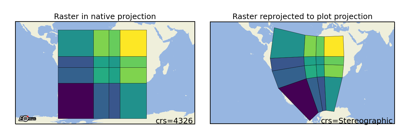
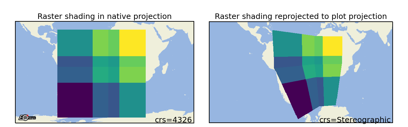
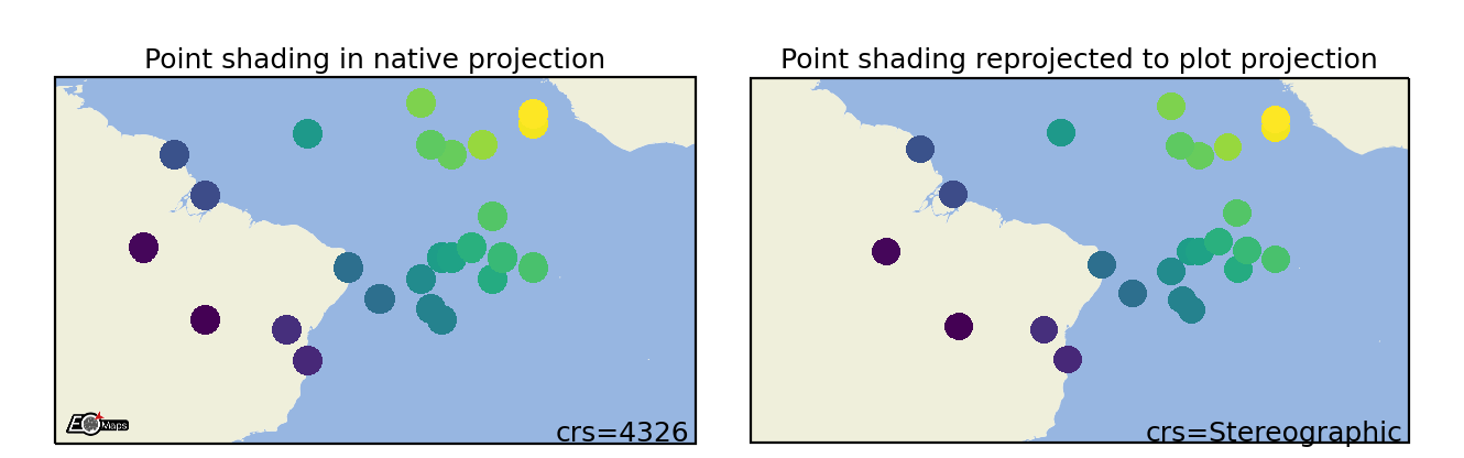
A note on data-reprojection…
EOmaps handles the reprojection of the data from the input-crs to the plot-crs.
Plotting data in its native crs will omit the reprojection step and is therefore a lot faster!
If your dataset is 2D (e.g. a raster), it is best (for speed and memory) to provide the coordinates as 1D vectors!
1D coordinate vectors will be broadcasted using matrix-indexing! (e.g.
x[nx], y[ny] -> data[nx, ny])Note that reprojecting 1D coordinate vectors to a different crs will result in (possibly very large) 2D coordinate arrays!
2) Plot shapes
To specify how a dataset is visualized on the map, you have to set the “plot-shape” via Maps.set_shape().
Set the plot-shape to represent the data-points. |
Available shapes (see bleow for details on each plot-shape!):
A note on speed and performance
Some ways to visualize the data require more computational effort than others! Make sure to select an appropriate shape based on the size of the dataset you want to plot!
EOmaps dynamically pre-selects the data with respect to the current plot-extent before the actual plot is created!
If you do not need to see the whole extent of the data, make sure to set the desired plot-extent
via Maps.set_extent() or Maps.set_extent_to_location() BEFORE calling Maps.plot_map() to get a (possibly huge) speedup!
The suggested “suitable datasizes” mentioned below always refer to the number of datapoints that are visible in the desired plot-extent.
For very large datasets, make sure to have a look at the raster, shade_raster, and shade_points shapes
which use fast aggregation techniques to resample the data prior to plotting. This way datasets with billions of datapoints can be
visualized fast.
Optional dependencies
shade_raster, and shade_points require the datashader package!
You can install it via:
mamba install -c conda-forge datashader
What’s used by default?
By default, the plot-shape is assigned based on the associated dataset.
For datasets with less than 500 000 pixels,
ellipsesis used.- For larger 2D datasets
rasteris used… andshade_points <Maps.set_shape.shade_pointsis attempted to be used for the rest.
Ellipses
Draw projected ellipses with dimensions defined in units of a given crs. |
Suitable data size |
Supported data structures |
|---|---|
up to ~500k datapoints |
1D, 2D or mixed |
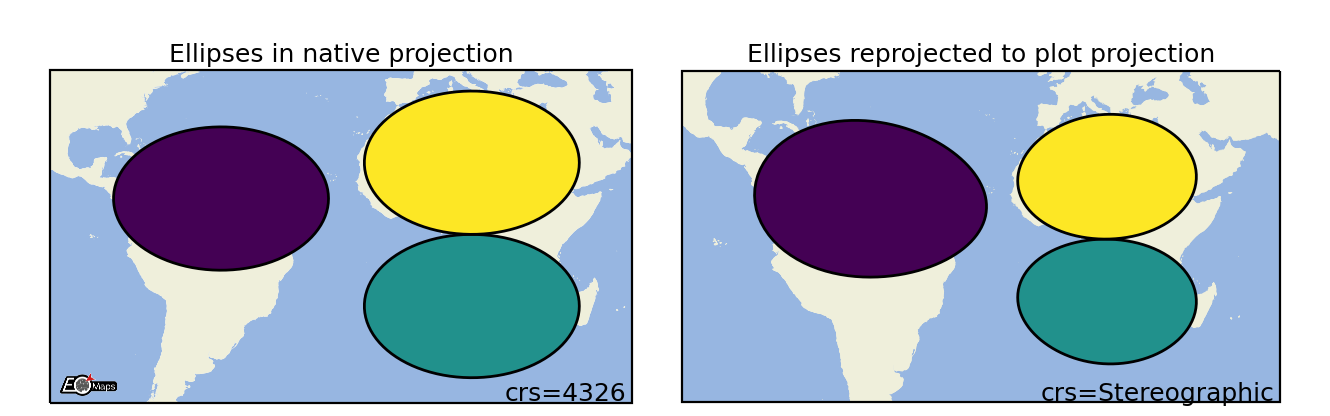
m.set_shape.ellipses(radius=(2, 5),   # ellipse dimensions [rx , ry]
                     radius_crs=4326, # projection in which the ellipse is defined
                     n=50             # number of calculated points on the ellipse
                     )
Rectangles
Draw projected rectangles with fixed dimensions (and possibly curved edges). |
Suitable data size |
Supported data structures |
|---|---|
up to ~500k datapoints |
1D, 2D or mixed |
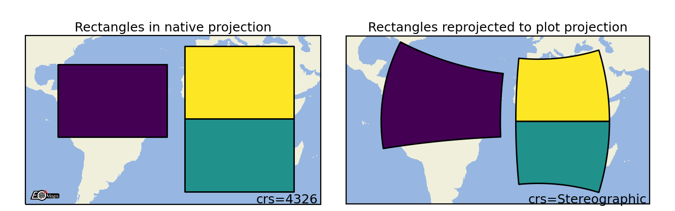
m.set_shape.rectangles(radius=(2, 5),   # rectangle dimensions [rx , ry]
                       radius_crs=4326, # projection in which the rectangle is defined
                       n=50             # number of calculated points on the ellipse
                       )
Geodesic Circles
Draw geodesic circles with a radius defined in meters. |
Suitable data size |
Supported data structures |
|---|---|
up to ~500k |
1D, 2D or mixed |
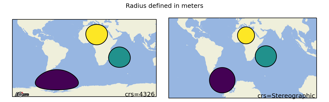
m.set_shape.geod_circles(radius=(2, 5),  # radius in meters
                         n=50             # number of calculated points on the circle
                         )
Voronoi Diagram
Draw a Voronoi-Diagram of the data. |
Suitable data size |
Supported data structures |
|---|---|
up to ~500k datapoints |
1D, 2D or mixed |
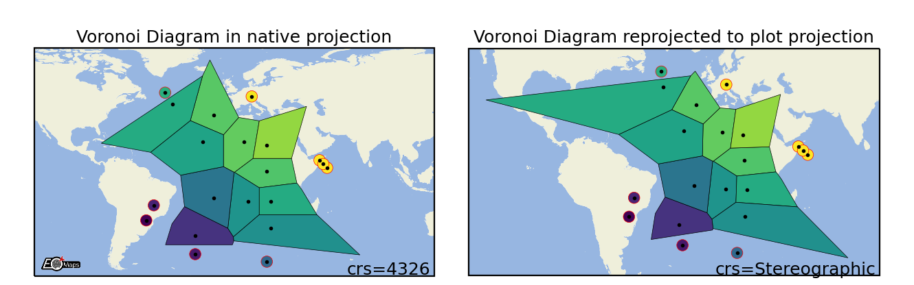
m.set_shape.voronoi_diagram(masked=True,      # mask too large polygons
                            mask_radius=10,   # min. size for masked polygons
                            )
Delaunay Triangulation
Draw a Delaunay-Triangulation of the data. |
Suitable data size |
Supported data structures |
|---|---|
up to ~500k datapoints |
1D, 2D or mixed |
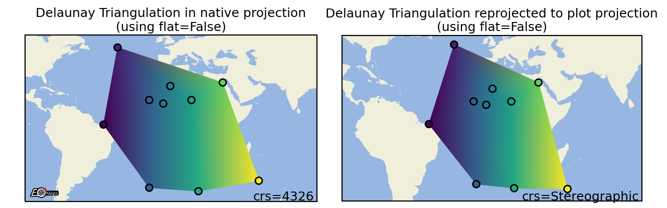
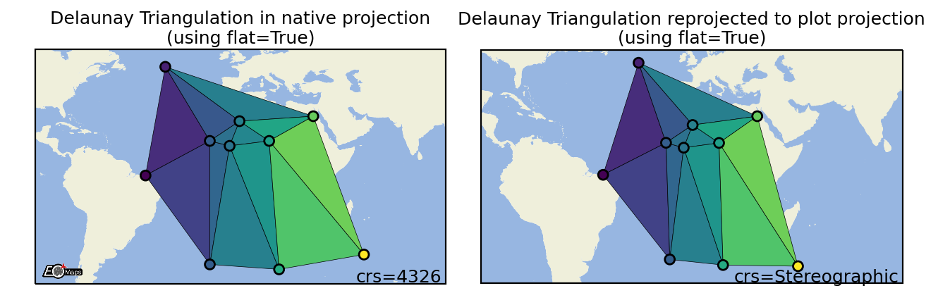
m.set_shape.delaunay_triangulation(flat=False,       # color=mean of triplet (True) or interpolated values (False)
                                   masked=True,      # mask too large polygons
                                   mask_radius=10,   # min. size for masked polygons
                                   mask_crs="in",     # projection of the mask dimension
                                  )
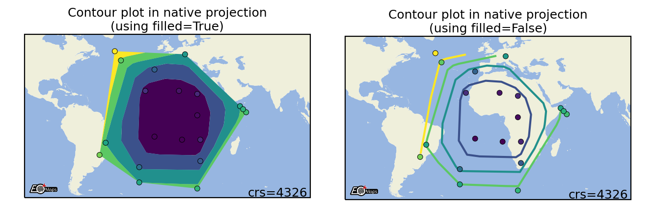
Contour plots
Draw a contour-plot of the data. |
Suitable data size |
Supported data structures |
|---|---|
up to a few million datapoints |
1D, 2D or mixed |
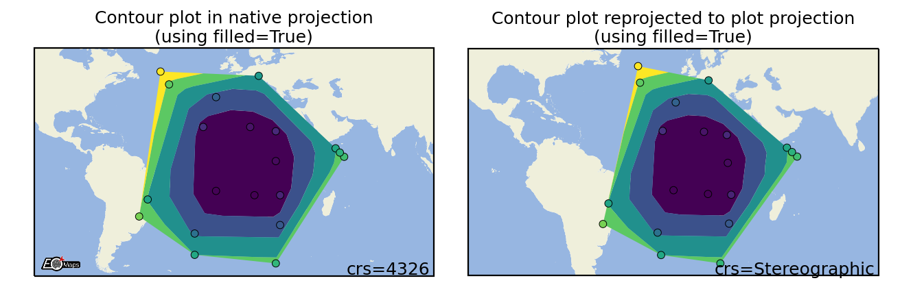
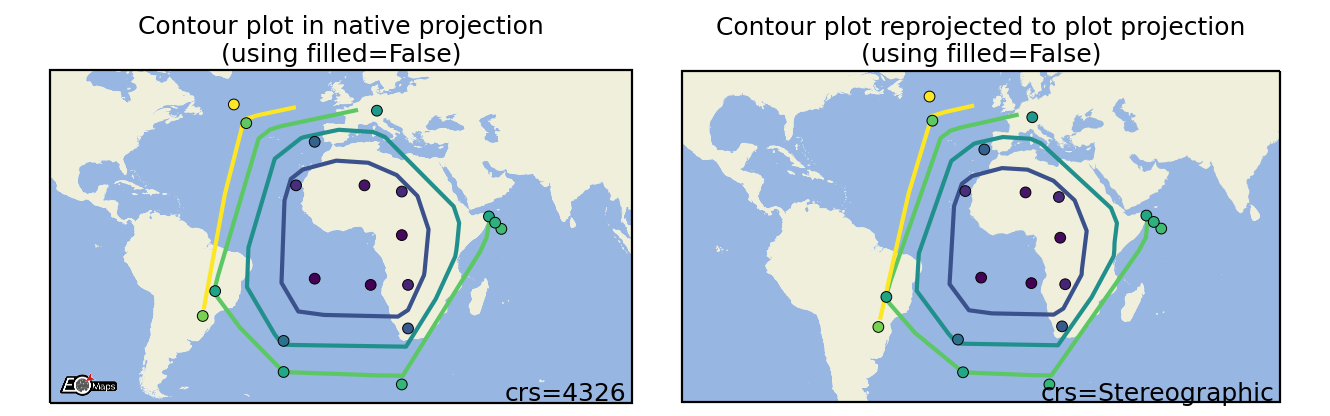
m.set_shape.contour(filled=True) # filled contour polygons (True) or contour lines (False)
Hexbin plots
Draw a 2D hexagonal binning plot of the data. |
Suitable data size |
Supported data structures |
|---|---|
up to a few million datapoints |
1D, 2D or mixed |
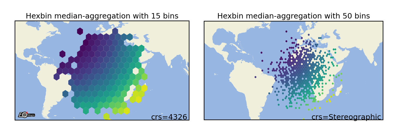
m.set_shape.hexbin(size=(40, 20),      # number of hexagons in x- and y-direction
                   aggregator="mean",  # the aggregation method to use
                   )
Scatter Points
Draw each datapoint as a shape with a size defined in points**2. |
Suitable data size |
Supported data structures |
|---|---|
~500k datapoints |
1D, 2D or mixed |
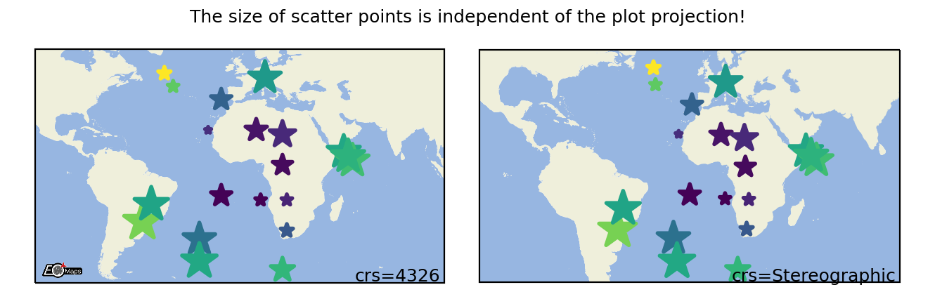
m.set_shape.scatter_points(size=[1, 2, 3],   # the marker size in points**2
                           marker="*",       # the marker shape to use
                           )
Raster
Draw the data as a rectangular raster (>> usable for very large datasets!) |
Suitable data size |
Supported data structures |
|---|---|
billions of datapoints (large datasets are pre-aggregated) |
2D or 1D coordinates + 2D data |
m.set_shape.raster(maxsize=5e5,         # data size at which aggregation kicks in
                   aggregator='mean',   # aggregation method to use
                   valid_fraction=0.5,  # % of masked values in aggregation bin for masked result
                   interp_order=0,      # spline interpolation order for "spline" aggregator
Shade Raster
Shade the data as a rectangular raster (>> usable for very large datasets!). |
|
Set the dpi used by "shade shapes" to aggregate datasets. |
Suitable data size |
Supported data structures |
Optional dependencies |
|---|---|---|
billions of datapoints (large datasets are pre-aggregated) |
2D or 1D coordinates + 2D data |
m.set_shape.shade_raster(aggregator='mean',    # aggregation method
                         shade_hook=None,      # datashader shade hook callback
                         agg_hook=None,        # datashader aggregation hook callback
                         )
Shade Points
Shade the data as a rectangular raster (>> usable for very large datasets!). |
|
Set the dpi used by "shade shapes" to aggregate datasets. |
Suitable data size |
Supported data structures |
Optional dependencies |
|---|---|---|
no limit (large datasets are pre-aggregated) |
1D, 2D or mixed |
m.set_shape.shade_raster(aggregator='mean',    # aggregation method
                         shade_hook=None,      # datashader shade hook callback
                         agg_hook=None,        # datashader aggregation hook callback
                         )
3) Classify the data
EOmaps provides an interface for mapclassify to classify datasets prior to plotting.
To assign a classification scheme to a Maps object, use m.set_classify.< SCHEME >(...).
Available classifier names are accessible via
Maps.CLASSIFIERS.
Interface to the classifiers provided by the 'mapclassify' module. |
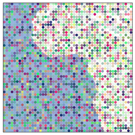
from eomaps import Maps
import numpy as np

data = np.random.normal(0, 1, (50, 50))
x = np.linspace(-45, 45, 50)
y = np.linspace(-45, 45, 50)

m = Maps(figsize=(4, 5))
m.add_feature.preset.coastline(lw=2)
m.add_feature.preset.ocean(zorder=99, alpha=0.5)
m.set_data(data, x, y)
m.set_shape.ellipses()
m.set_classify.StdMean(multiples=[-1.5, -.5, .5, 1.5])
m.plot_map(vmin=-3, vmax=3)

cb = m.add_colorbar(pos=0.2, label="StdMean classification")
cb.tick_params(labelsize=7)
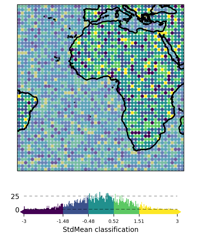
Currently available classification-schemes are (see mapclassify for details):
4) Plot the data
Now that the data is assigned to a Maps object, you can trigger plotting the data via Maps.plot_map().
Any additional keyword-arguments passed to Maps.plot_map() are forwarded to the actual
matplotlib plot-command for the selected shape.
Useful arguments that are supported by all shapes are:
"cmap": the colormap to use
"vmin", “vmax” : the range of values used when assigning the colors
"alpha": the color transparency
"zorder": the “stacking-order” of the feature
- Arguments that are supported by all shapes except
shadeshapes are: "fc"or"facecolor": set the face color for the whole dataset"ec"or"edgecolor": set the edge color for the whole dataset"lw"or"linewidth": the line width of the shapes
By default, the plot-extent of the axis is adjusted to the extent of the data if the extent has not been set explicitly before.
To always keep the extent as-is, use m.plot_map(set_extent=False).
from eomaps import Maps
m = Maps()
m.add_feature.preset.ocean()

m.set_data(
    data=[1, 2, 3, 4, 5],
    x = [-10, 20, 40, 60, 70],
    y = [-10, 20, 50, 70, 30])
m.set_shape.geod_circles(radius=7e5)
m.plot_map(cmap="viridis", set_extent=False)
You can then continue to add a 🌈 Colorbars (with a histogram) or create Zoomed in views on datasets.
Plot the dataset assigned to this Maps-object. |
|
Save the current figure. |
Customize the plot
All arguments to customize the appearance of a dataset are passed to Maps.plot_map().
In general, the colors assigned to the shapes are specified by
selecting a colormap (
cmap)either a name of a pre-defined
matplotlibcolormap (e.g."viridis","RdYlBu"etc.)or a general
matplotlibcolormap object (see matplotlib-docs for more details)
(optionally) setting appropriate data-limits via
vminandvmax.vminandvmaxset the range of data-values that are mapped to the colorbar-colorsAny values outside this range will get the colormaps
overandundercolors assigned.
from eomaps import Maps
m = Maps()
m.set_frame(rounded=0.2)
m.add_feature.preset.ocean()
m.add_feature.preset.land(fc="k")

m.set_data(
    data=[1, 2, 3, 4, 5],
    x = [-10, 20, 40, 60, 70],
    y = [-10, 20, 50, 70, 30])
m.set_shape.geod_circles(radius=1e6)
m.plot_map(
    cmap="tab10", # the colormap to use
    vmin=2,       # min value for cmap
    vmax=4,       # max value for cmap
    alpha=0.8,    # transparency
    ec="w",       # edgecolor
    lw=1.5,       # linewidth
    ls="--"       # linestyle
    )
Colors can also be set manually by providing one of the following arguments to Maps.plot_map():
to set both facecolor AND edgecolor use
color=...to set the facecolor use
fc=...orfacecolor=...to set the edgecolor use
ec=...oredgecolor=...
Note
Manual color specifications do not work with the
shade_rasterandshade_pointsshapes!Providing manual colors will override the colors assigned by the
cmap!The
colorbardoes not represent manually defined colors!
Uniform colors
To apply a uniform color to all datapoints, you can use matpltolib’s named colors or pass an RGB or RGBA tuple.
m.plot_map(fc="orange")m.plot_map(fc=(0.4, 0.3, 0.2))m.plot_map(fc=(1, 0, 0.2, 0.5))
from eomaps import Maps

m = Maps()
m.add_feature.preset("coastline", "ocean")
m.set_data(data=None, x=[10,20,30], y=[10,20,30])

# Use any of matplotlibs "named colors"
m1 = m.new_layer(inherit_data=True)
m1.set_shape.ellipses(radius=10)
m1.plot_map(fc="r", zorder=0)

m2 = m.new_layer(inherit_data=True)
m2.set_shape.ellipses(radius=8)
m2.plot_map(fc="orange", zorder=1)

# Use RGB tuples (r, g, b)
m3 = m.new_layer(inherit_data=True)
m3.set_shape.ellipses(radius=6)
m3.plot_map(fc=(1, 0, 0.5), zorder=2)

# Use RGBA tuples (r, g, b, alpha)
m4 = m.new_layer(inherit_data=True)
m4.set_shape.ellipses(radius=4)
m4.plot_map(fc=(1, 1, 1, .75), zorder=3)

# For grayscale use a string of a number between 0 and 1
m5 = m.new_layer(inherit_data=True)
m5.set_shape.ellipses(radius=2)
m5.plot_map(fc="0.3", zorder=4)
Explicit colors
To explicitly color each datapoint with a pre-defined color, simply provide a list or array of the aforementioned types.
from eomaps import Maps

m = Maps()
m.add_feature.preset("coastline", "ocean")
m.set_data(data=None, x=[10, 20, 30], y=[10, 20, 30])

# Use any of matplotlibs "named colors"
# (https://matplotlib.org/stable/gallery/color/named_colors.html)
m1 = m.new_layer(inherit_data=True)
m1.set_shape.ellipses(radius=10)
m1.plot_map(fc=["indigo", "g", "orange"], zorder=1)

# Use RGB tuples
m2 = m.new_layer(inherit_data=True)
m2.set_shape.ellipses(radius=6)
m2.plot_map(fc=[(1, 0, 0.5),
                (0.3, 0.4, 0.5),
                (1, 1, 0)], zorder=2)

# Use RGBA tuples
m3 = m.new_layer(inherit_data=True)
m3.set_shape.ellipses(radius=8)
m3.plot_map(fc=[(1, 0, 0.5, 0.25),
                (1, 0, 0.5, 0.75),
                (0.1, 0.2, 0.5, 0.5)], zorder=3)

# For grayscale use a string of a number between 0 and 1
m4 = m.new_layer(inherit_data=True)
m4.set_shape.ellipses(radius=4)
m4.plot_map(fc=[".1", ".2", "0.3"], zorder=4)
RGB/RGBA composites
To create an RGB or RGBA composite from 3 (or 4) datasets, pass the datasets as tuple:
the datasets must have the same size as the coordinate arrays!
the datasets must be scaled between 0 and 1
If you pass a tuple of 3 or 4 arrays, they will be used to set the RGB (or RGBA) colors of the shapes, e.g.:
m.plot_map(fc=(<R-array>, <G-array>, <B-array>))m.plot_map(fc=(<R-array>, <G-array>, <B-array>, <A-array>))
You can fix individual color channels by passing a list with 1 element, e.g.:
m.plot_map(fc=(<R-array>, [0.12345], <B-array>, <A-array>))
from eomaps import Maps
import numpy as np

x, y = np.meshgrid(np.linspace(-30, 30, 50),
                   np.linspace(30, 30, 50))

# values must be between 0 and 1
r = np.random.randint(0, 100, x.shape) / 100
g = np.random.randint(0, 100, x.shape) / 100
b = [0.4]
a = np.random.randint(0, 100, x.shape) / 100

m = Maps()
m.add_feature.preset.ocean()
m.set_data(data=None, x=x, y=y)
m.plot_map(fc=(r, g, b, a))
🌈 Colorbars (with a histogram)
Before adding a colorbar, you must plot the data using m.plot_map(vmin=..., vmax=...).
vminandvmaxhereby specify the value-range used for assigning colors (e.g. the limits of the colorbar).If no explicit limits are provided, the min/max values of the data are used.
For more details, see 🔴 Data Visualization.
Once a dataset has been plotted, a colorbar with a colored histogram on top can be added to the map by calling Maps.add_colorbar().
Note
Maps.plot_map().Maps object for each dataset! (e.g. via m2 = m.new_layer())Note
Colorbars are only visible if the layer at which the data was plotted is visible!
from eomaps import Maps
import numpy as np
data = np.random.normal(0, 1, (50, 50))
x = np.linspace(-45, 45, 50)
y = np.linspace(-45, 45, 50)
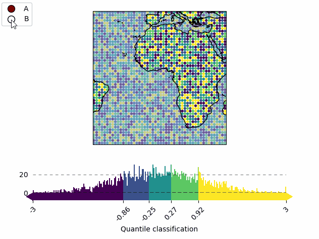
m = Maps(layer="all")
m.add_feature.preset.coastline()
m.add_feature.preset.ocean(zorder=99, alpha=0.5)
m.util.layer_selector(loc="upper left")
mA = m.new_layer("A")
mA.set_data(data, x, y)
mA.set_classify.Quantiles(k=5)
mA.plot_map(vmin=-3, vmax=3)
cbA = mA.add_colorbar(label="Quantile classification")
cbA.tick_params(rotation=45)
mB = m.new_layer("B")
mB.set_data(data, x, y)
mB.set_classify.EqualInterval(k=5)
mB.plot_map(vmin=-3, vmax=3)
cbB = mB.add_colorbar(label="EqualInterval classification")
cbB.tick_params(labelcolor="darkblue", labelsize=9)
m.subplots_adjust(bottom=0.1)
m.show_layer(mA.layer)
Add a colorbar to the map. |
The returned ColorBar-object has the following useful methods defined:
Set the position of the colorbar (and all colorbars that share the same location) |
|
Set the labels (and the label-style) for the colorbar (and the histogram). |
|
Set the size of the histogram (relative to the total colorbar size) |
|
Set the appearance of the colorbar (or histogram) ticks. |
|
Set the visibility of the colorbar. |
Set colorbar tick labels based on bins
To label the colorbar with custom names for a given set of bins, use ColorBar.set_bin_labels():
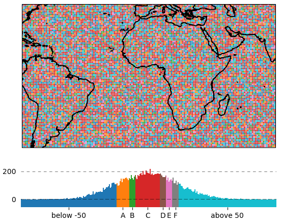
import numpy as np
from eomaps import Maps
# specify some random data
lon, lat = np.mgrid[-45:45, -45:45]
data = np.random.normal(0, 50, lon.shape)

# use a custom set of bins to classify the data
bins = np.array([-50, -30, -20, 20, 30, 40, 50])
names = np.array(["below -50", "A", "B", "C", "D", "E", "F", "above 50"])

m = Maps()
m.add_feature.preset.coastline()
m.set_data(data, lon, lat)
m.set_classify.UserDefined(bins=bins)
m.plot_map(cmap="tab10")
m.add_colorbar()

# set custom colorbar-ticks based on the bins
m.colorbar.set_bin_labels(bins, names)
Set the tick-labels of the colorbar to custom names with respect to a given set of bins. |
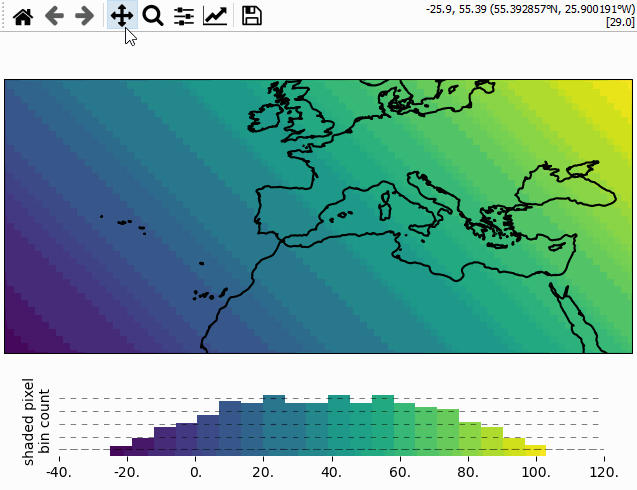
Using the colorbar as a “dynamic shade indicator”
Note
This will only work if you use m.set_shape.shade_raster() or m.set_shape.shade_points() as plot-shape!
For shade shapes, the colorbar can be used to indicate the distribution of the shaded
pixels within the current field of view by setting dynamic_shade_indicator=True.
from eomaps import Maps
import numpy as np
x, y = np.mgrid[-45:45, 20:60]

m = Maps()
m.add_feature.preset.coastline()
m.set_data(data=x+y, x=x, y=y, crs=4326)
m.set_shape.shade_raster()
m.plot_map()
m.add_colorbar(dynamic_shade_indicator=True, hist_bins=20)